By Catherine Austin Fitts
My “go to” website for technical analysis of precious metals, the US dollar & the US stock market is Rambus Chartology, where Rambus (that’s his handle – he’s the founding technical analyst) leads a discussion with extensive charts of what the markets are saying.
In January 2016, Rambus launched his quarterly Solari Report with a Blockbuster Chartology. You can find links to the entire series of quarterly and annual Blockbuster Chartologies at the end this latest piece.
One of the reasons that Rambus is so good at his craft is that he focuses on “staying on the right side of the major trend.” The challenge of doing so at this time is that it is tempting to look for bottoms or to assume that the trend upwards in the US dollar or stock market may be over. However, Rambus consistently brings us back to the discipline of the Chartology. What does price tell us? As he describes so aptly, we are dealing with psychological warfare.
Sitting back once each quarter to get this perspective offers invaluable insight. So, here we go for the 2nd Quarter 2019 Blockbuster Chartology!
Blockbuster Chartology Quarterly Report
By Rambus
~ 2nd Quarter 2019 Wrap Up ~
Quarterly Report Part 1 : US Stock Markets
Quarterly Report Part 2 : Market Sectors
Quarterly Report Part 3 : World Stock Markets
Quarterly Report Part 4 : Precious Metals Complex…
Quarterly Report Part 5 : Currencies
Quarterly Report Part 1 : US Stock Markets
It’s that time again when I break out the long term charts for the “Quarterly Report” I do for Catherine Austin Fits who is the founder of the Solari Report. Doing these quarterly reports every three months forces me to look at the long term picture for the stock markets and other areas of the markets which is the most important aspect of trading the intermediate to long term trends. If we understand what direction the big picture charts are suggesting it reduces our chances by 50% of being wrong.
What that means is that in a bull market the odds are heavily in your favor if you trade the long side because if your entry point isn’t the best the bull market will eventually make it right. On the other hand, if you go short in a bull market you are constantly fighting against the uptrend that can have serious consequences if you don’t have the discipline to get out of a trade when you recognize when you are wrong. Holding on to a losing trade and hoping the market will save you when you are on the wrong side of a bull market is the surest way to fail as an investor.
What most of these long term charts I use for the Quarterly Report have in common is that there is a massive consolidation pattern that began to buildout at the tech bubble high in 2000 to the breakout some 13 years later in 2013 which completed these massive consolidation patterns. I know most are tired of hearing me say, “big patterns lead to big moves,” but when you see what has and is transpiring in regards to the big picture look , it’s undeniable IMHO.
A well constructed chart should tell a story of what investors have been doing with their hard earned capital by what the Chartology is suggesting. Keep in mind when you look at a chart it shows what the sum total of every investor, either a bull or bear thinks of a company or stock market by either buying or selling their shares in real time. This is why certain patterns form on a chart as the bulls and the bears fight it out , which leaves some type of recognizable chart pattern when the battle ends. In a bull market those battles show up as consolidation patterns which will resolve themselves in the direction of the bull market. It’s only when a bull market comes to an end will what looks like the next consolidation pattern in the ongoing bull market, end up being a reversal pattern that will end the bull market . This will be the beginning of a new bear market. The bottom line is that the “trend is your friend” until you see a confirmed reversal pattern.
In part one of this Quarterly Report we’ll look at the US stock markets that we’ve been following for many years now regarding the big picture that has shown the 2009 bull market in all its glory. I realize that many will be very sceptical of these charts and the bull market they have painted since the 2009 low, and that’s fine. The job of a healthy bull market is to keep most investors on the sidelines until the parabolic blowoff phase takes hold , when it will give everyone who has been on the sidelines every chance to get in. Once the euphoria ends so will the bull market and a new bear market will begin, rinse and repeat.
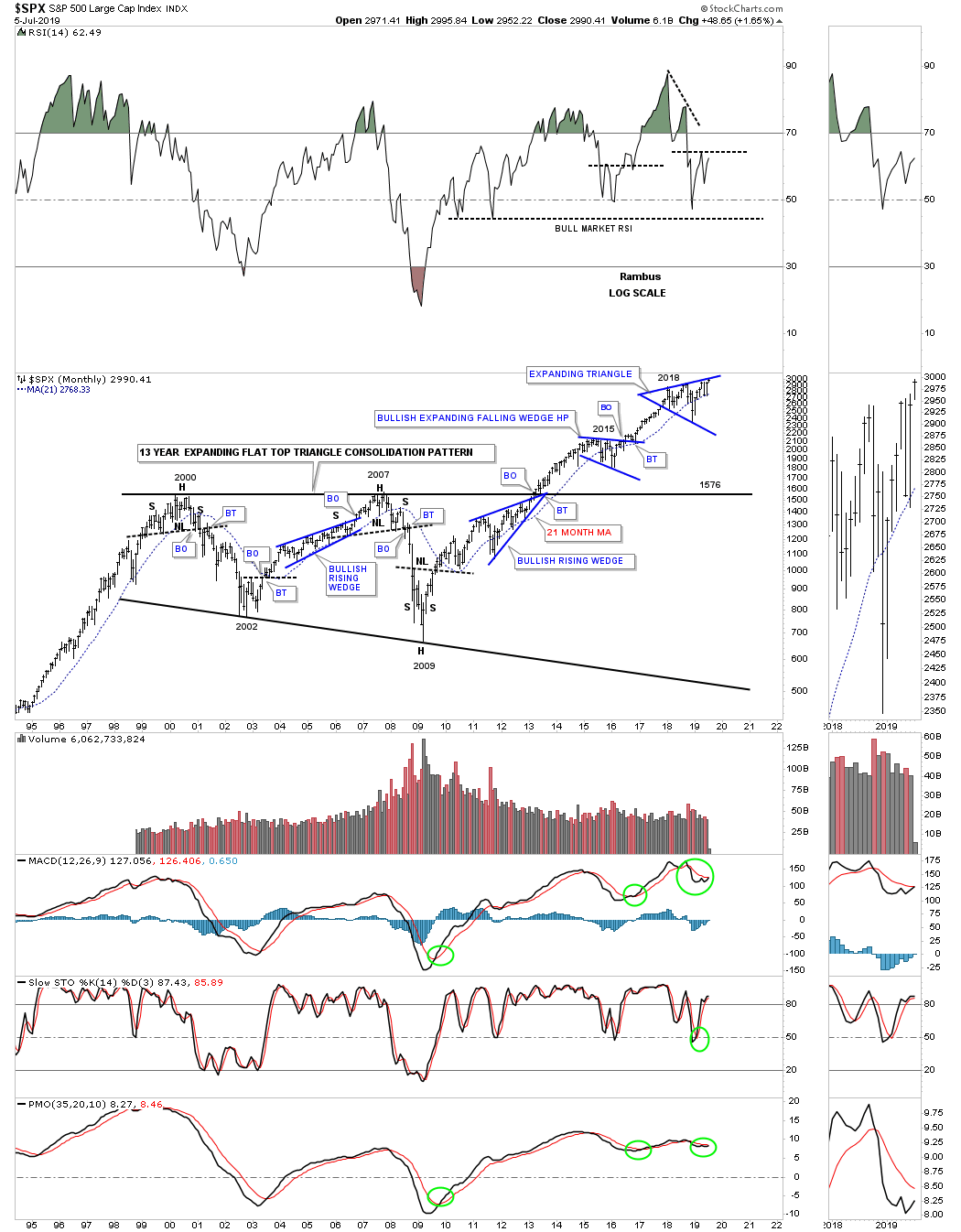
Lets start with the most important stock index on the planet the SPX. Here you can see the 13 year flat top expanding triangle that broke out above the top rail in 2013 which confirmed the new secular bull market was underway. During the formation of that 13 year massive consolidation pattern note how each reversal point formed at an important area on the chart. The first reversal point formed at the 2000 high with the second reversal point at the bear market low in 2002 followed by the bull market that ended in 2007 with the H&S top. Reversal point number four ended with the worst bear market since 1929 which felt like the end of the world especially if you didn’t heed the Chartology.
Out of the ashes from that 2009 crash low began the biggest bull market in history which is still ongoing to this day. From a Chartology perspective it just doesn’t get any prettier. After the H&S bottom at the 2009 low was in place the SPX has been forming one consolation pattern on top of the previous one starting with the bullish rising wedge which formed just below the top rail of the massive 13 year flat top triangle. We’ve discussed many times in the past that when you see a consolidation pattern form just below an important trendline it can be a very bullish development. The reason it’s a bullish setup is because the consolidation pattern is building up the energy that is going to be needed to break though 13 years of overhead resistance.
Once last thing to notice on this long term chart and that is the impulse move that takes place between each consolidation pattern which is how markets work. I know many are looking at our latest trading range, the 2018 expanding triangle, as the end of the bull market and a crash of epic proportion will soon be upon us. The true breakout above the top rail hasn’t yet occurred but if it does we will see another impulse leg higher in the ongoing bull market that began at the 2009 crash low. If the bears are correct then we’ll see the bottom rail of the expanding triangle give way which would be the official end of the 2009 bull market.
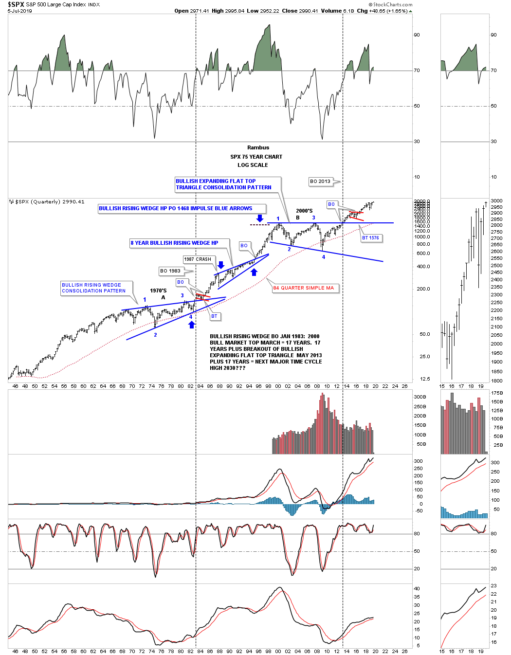
We discussed perviously how a big chart pattern can lead to a big move. Below is a 75 year look at the SPX which puts the 13 year flat top expanding triangle in focus and why I believe the next impulse move to the upside may be close at hand. Please note the massive bullish rising wedge which began to form in 1966 which was completed in 1983 when the top rail was broken to the upside. That massive bullish rising wedge was responsible for the secular bull market that followed which didn’t end until the high made in 2000 which began the 13 year bullish flat top triangle consolidation pattern. There was also another bullish rising wedge which formed as a halfway pattern as shown by the blue arrows that had a price objective up to the 1468 area which was just shy of the all time high back then. Looking at the thumbnail on the right side of the chart you can see the SPX is trading at new all time highs much to the displeasure of the many bears who have been fighting this secular bull market since it began in 2009.
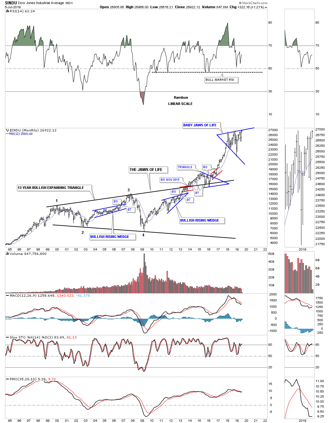
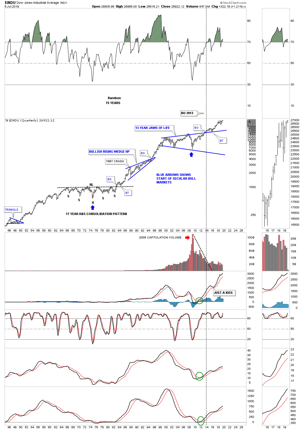
Next lets look at the INDU and the infamous “JAWS OF LIFE” consolidation pattern that many were calling the, Jaws of Death, and the end of the bull market during its formation. Just like most of the big 13 year consolidation patterns that have formed on many of the US stock markets the INDU did breakout above the top rail of its 2013, Jaws of Life consolidation pattern, but it had a laborious backtest which took several years to complete. Even though the backtesting process took a long time to complete I never gave up that we would see a bullish outcome which we had already seen with the SPX. Note our current consolidation pattern, the blue expanding triangle, which I’ve labeled as, “Baby Jaws of Life” that I expect to see a breakout above the top rail continuing the bull market that began in 2009.
Next is the 75 year quarterly chart for the INDU which puts the 13 year Jaws of Life consolidation pattern in perspective. First note the 17 year H&S consolidation pattern which formed from 1966 to the breakout in 1982 which again led to the secular bull market that ended in 2000. Most have forgotten the worse trading day in US history occurred in 1987 that truly felt like the end of the world. As you can see what felt like the end of the world was only the beginning of the next consolidation phase that built out the bullish rising wedge halfway pattern. Note how similar the breaking out and backtesting process was to the 1970’s neckline and the top rail of the Jaws of Life. That’s classic Chartology on any timeframe.
Now that you have the basic understanding of what I’m looking at in regards to the big picture I’m going to go through the rest of the long term charts fairly quickly as there are a ton of charts to show you.
During the last secular bull market the NDX 100 produced a parabolic move into its 2000 high which marked the beginning of its 10 year triangle consolidation pattern. Note the classic H&S bottom that formed at the last reversal point in the 10 year triangle with the left shoulder and head forming inside the triangle while the right shoulder low formed on the backtest to the top rail. Also note the blue triangle that formed just below the all time highs which finally gave the NDX enough energy to breakout above the old all time highs to new all time highs which has led to our current 2018 trading range.
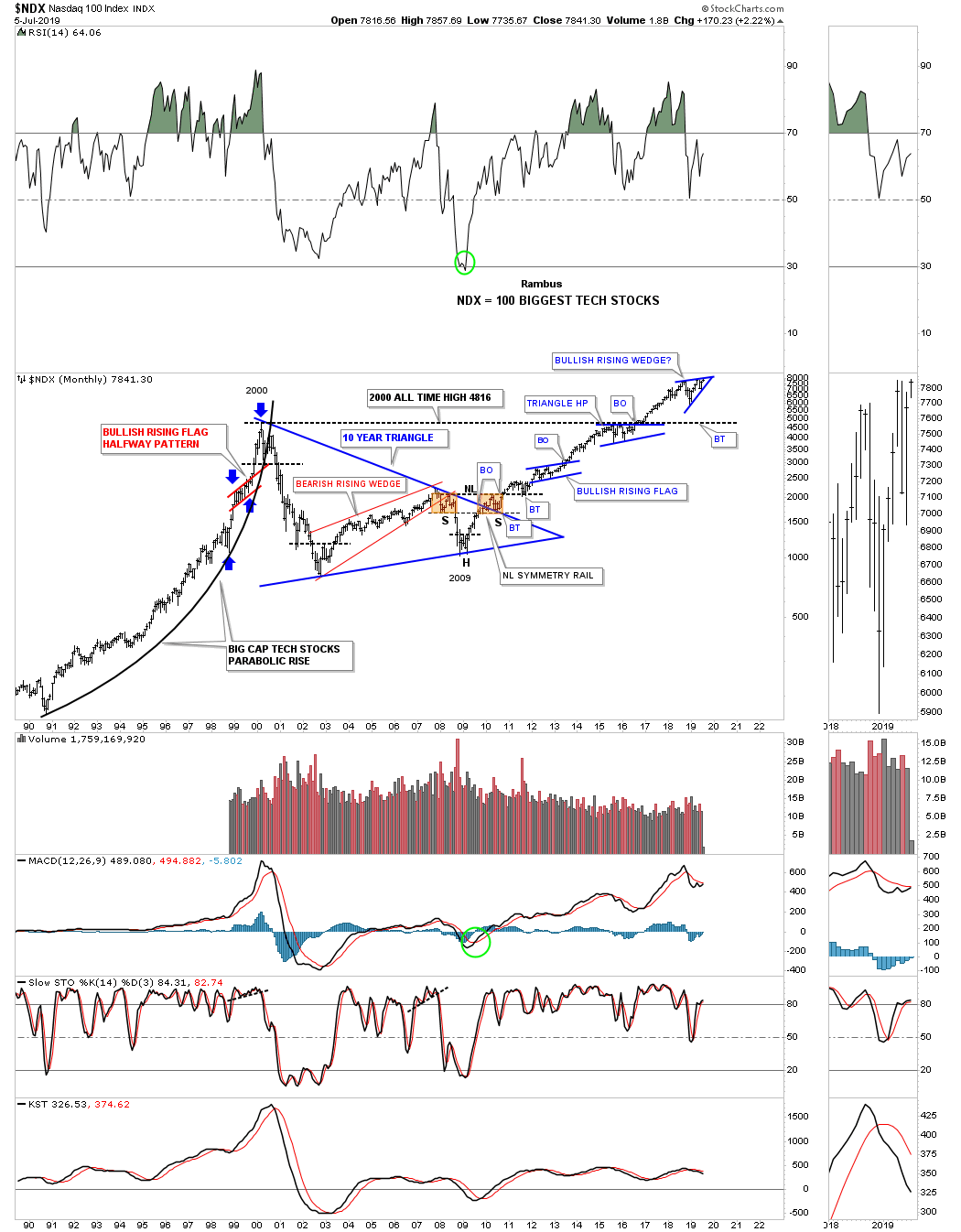
Below is a shorter term monthly chart for the NDX that shows its 2009 bull market. After building out the very symmetrical 2009 H&S bottom which was needed to reverse the bear market the NDX has enjoyed a strong bull market. The reason it’s is a strong bull market is because of the bullish rising patterns that make up the 2009 bull market. As we’ve discussed many times in the past when you see a consolidation pattern that slopes up in the direction of the main trend it tells you the trend is very strong. We still haven’t gotten confirmation on the breakout of our latest consolidation pattern, the possible bullish rising wedge, but if we do get one to the upside the NDX will enjoy another impulse move higher. This monthly chart also shows you that the 2009 bull market is starting to go parabolic as all good bull markets usually do.
The last point I would like to make on this chart has to do with the 2016 – 2018 impulse move. I know many precious metals investors want nothing to do with the stock markets which can be a big mistake. During the correction in the PM complex that started in August of 2016 the NDX and other US stock markets had one of their strongest impulse leg up in the entire bull market which we traded waiting for the correction in the PM complex to complete. They say there is a bull market somewhere, we just need to find it.

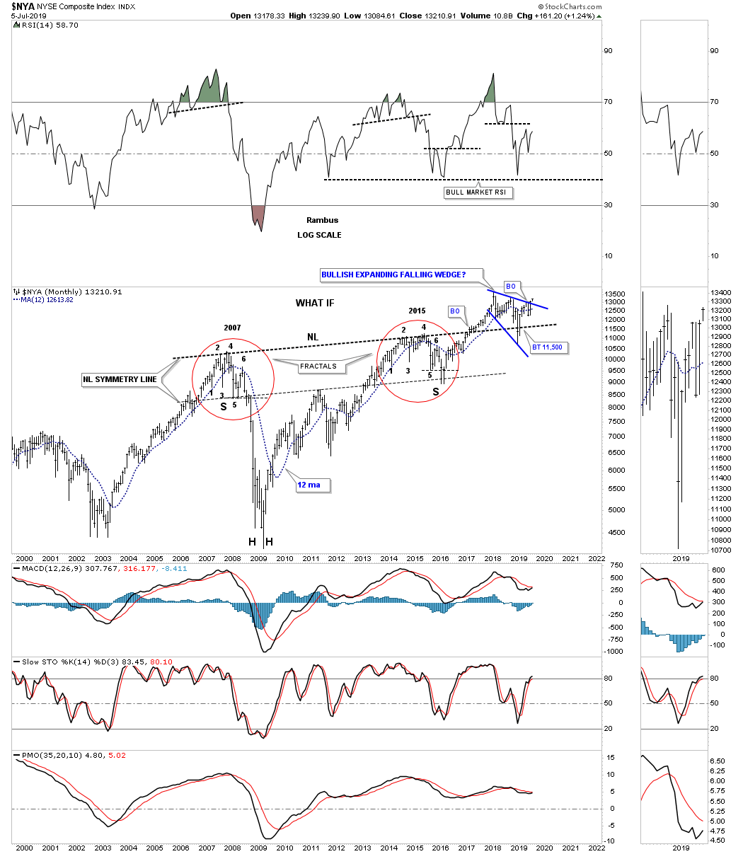
Next up is the $NYA which is setup a bit differently than most of the other US stock markets we’ve looked. It has formed a 10 year bullish rising wedge with the breakout taking place in May of 2017. As you can see the backtest was a little strong but the apex held support during the formation of the bullish expanding falling wedge that shows the top rail giving way.
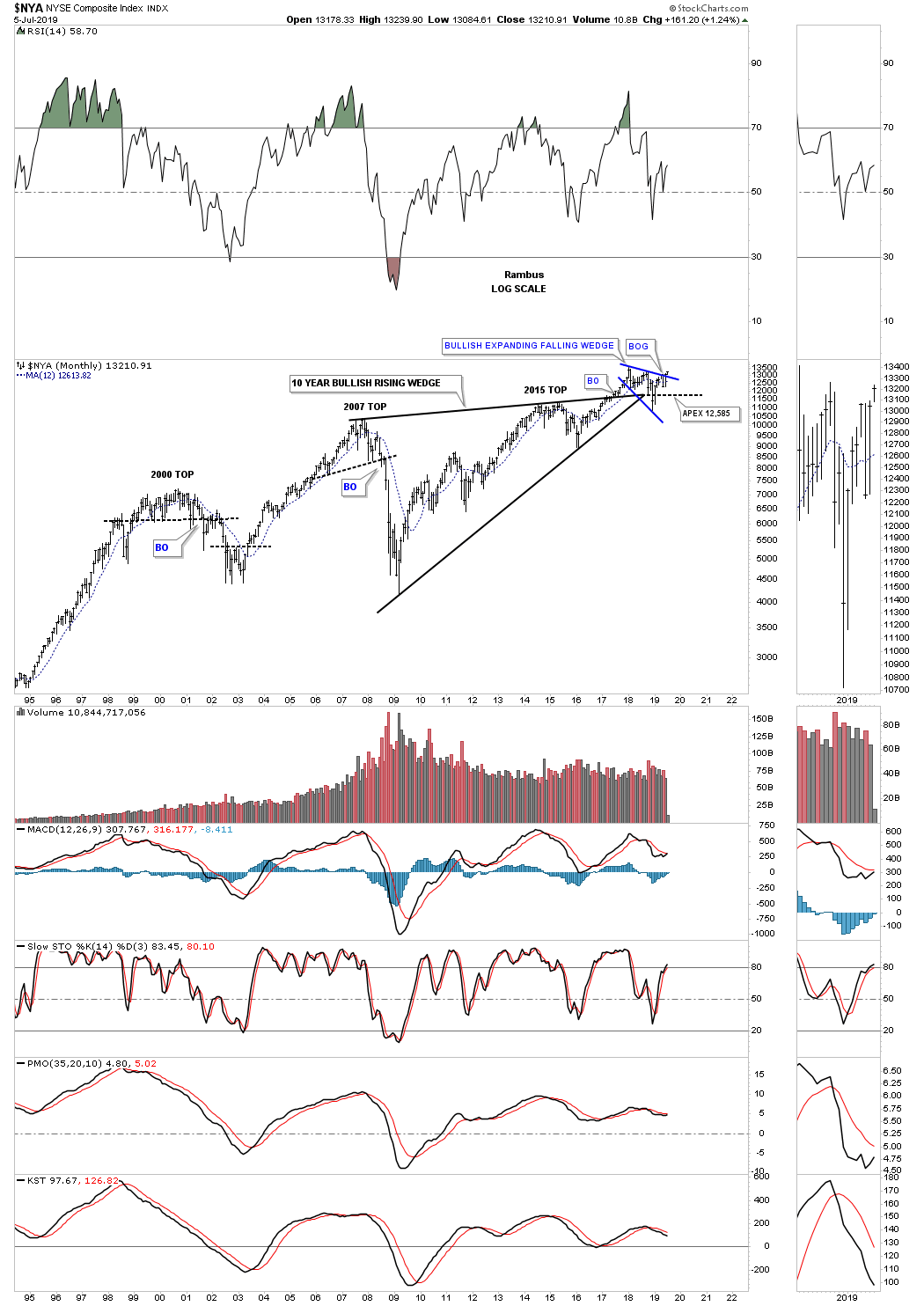
Then there is the other big pattern we’ve been following on the NYA which is the massive fractal H&S consolidation pattern. Note the backtest to the neckline which was put in place during the strong move lower into the Christmas Eve low last year. What if all the work is now done in regards to the breaking out and backtesting of the neckline? This massive H&S consolidation pattern is just beginning to show its next move higher that could last for some time.
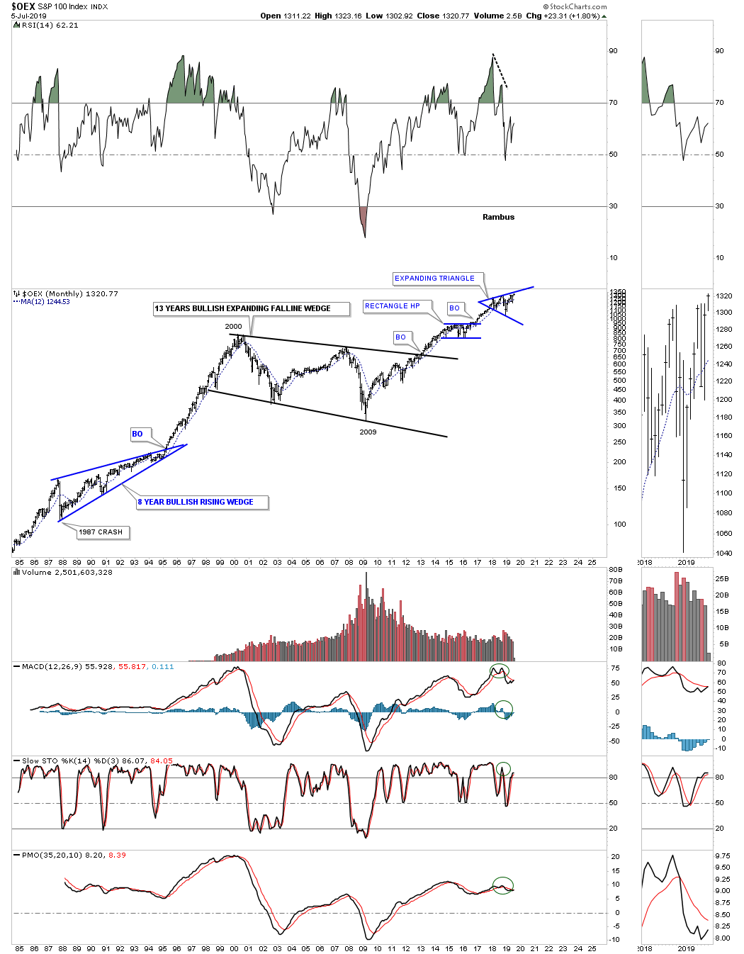
Below is 35 year look at the OEX 100 which shows its own 13 year bullish expanding falling wedge consolidation pattern.
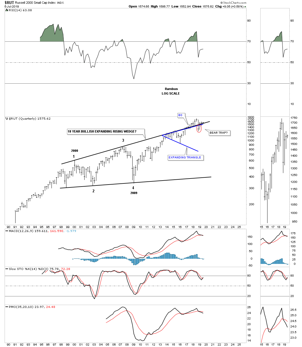
The best way to view the long term chart pattern for the $RUT 2000 is to look at a quarterly chart because the pattern is so big. As you can see the price action starting at the 2000 bull market high has produced a series of higher highs and higher lows which is creating an 18 year bullish expanding rising wedge. We did see a failure of the top rail but the RUT has since rallied back above the top rail that is suggesting the strong backtest may have been a bear trap, red circle.
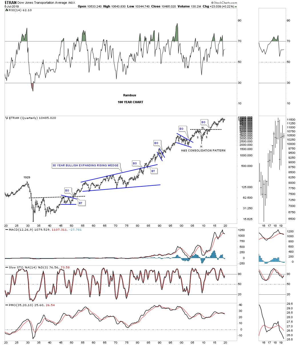
Next is a 20 year chart for the Transportation Average with the dominate chart pattern being the massive 2009 H&S consolidation pattern which was very symmetrical as shown by the neckline symmetry line. The Transportation Average has been working on its latest consolidation pattern which is the blue diamond. There is still more work to be done before the diamond finishes building out but in a bull market the odds favor an upside breakout.
![]()
This last chart for the US stock markets is the 100 year chart for the Transportation Average. You may have wondered why I called the dominate chart pattern on the monthly chart above a H&S consolidation pattern? The reason is on this 100 year chart below. What this chart also shows us is that Chartology is still as relevant today as it was 100 years ago because investors psychology is still the same and represents the battles between the bulls and the bears fighting it out for control of the major trend.
This concludes the first installment of the Quarterly Report. Next we’ll look at some of the important stock markets of the world that may be a bit surprising to many. All the best…Rambus
Quarterly Report Part 2 : Market Sectors
In part 2 of this Quarterly Report I would like to show you some of the many different sectors that make up the stock markets. If many of the different sectors are not showing bull market characteristics then the bull market can’t continue to go up. During a strong bull market money can rotate form one sector to another which is healthy. As long as capital remains in the markets, rotating from one sector to another, the bull market can remain intact. It’s when you begin see capital leaving the stock markets that brings up a red flag.
Many of the sectors we’ll look at tonight have been consolidating their last impulse leg up for several years which has allowed capital to leave and find a home in another sector. Again, in a healthy bull market we will want to see capital rotate back into the areas that have been in consolidation mode and getting ready for their next impulse move. At some point the bull market will come to an end and that is when we will see capital leave the stock markets looking for a new bull market somewhere else.
These charts to follow are all long term charts that show the big picture which is most important to understand. Until we begin to see some of these trading ranges break to the downside we have to assume the 2009 secular bull market remains in place regardless of all the reasons it has to end.
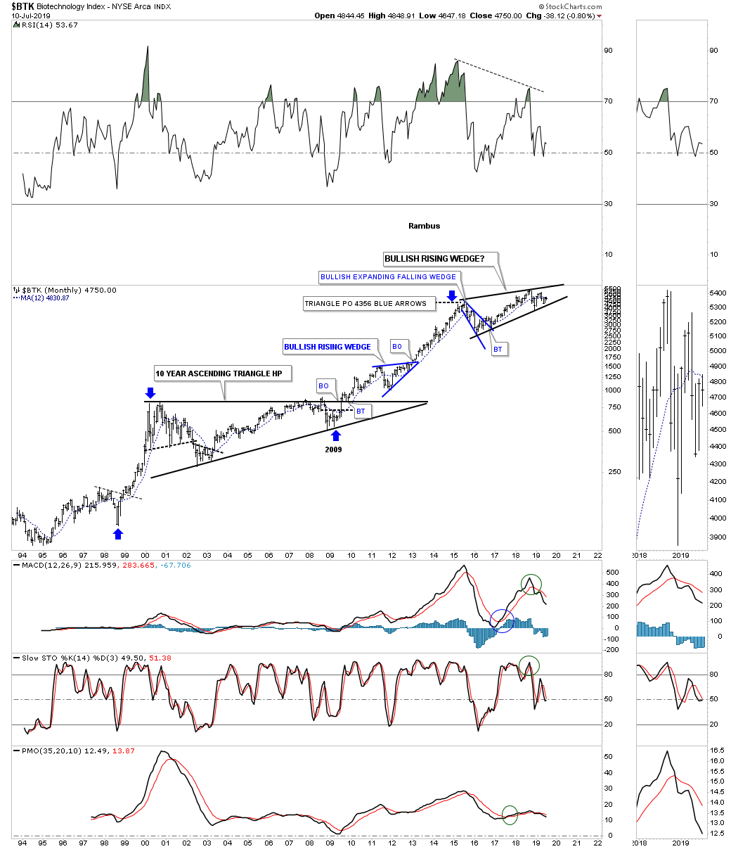
Lets start with the $BTX, biotechnology index, which was the strongest sector out of the 2009 crash low. Note the 10 year ascending triangle that led to the massive impulse move into the July 2015 high. The $BTK needed to consolidate those gains and has been building out a four year rising wedge formation. Most will view the four year rising wedge as a bearish rising wedge that will end the bull market. My experienced with these types of patterns that show up in a strong bull market can just as easily breakout to the upside. If the bottom rail gives way then I will have to concede victory to the bears.
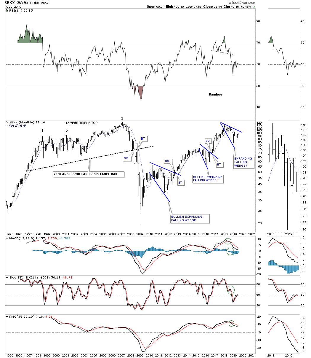
An important sector that will need to be strong if the bull market is going to continue is the $BXX, bank index. Since its bull market began at the 2009 crash low this index has gained back all the lost ground it gave up during the 2008 crash. The latest consolidation pattern is the 3rd expanding falling wedge, that has formed at the all time high, which is a normal development when important overhead resistance is reached. The key now is to see the top rail broken to the upside that will put into motion another impulse move higher similar to the previous two breakouts. This chart also shows you a good example of the impulse moves that occur once a reversal pattern or consolidation pattern completes. As always the bigger the reversal pattern or consolation pattern the bigger the impulse move.
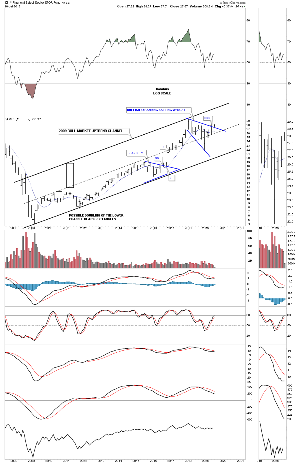
Below is the XLF, financial sector, which shows its beautiful 2009 bull market uptrend channel. The latest consolidation pattern to have formed in the 2009 bull market uptrend channel is the blue 2018 expanding falling wedge. If you look real close at this months bar you can see a breakout gap above the top rail which is extremely rare on a monthly chart. To negate the breakout we would need to see the price action trade back below the top rail.
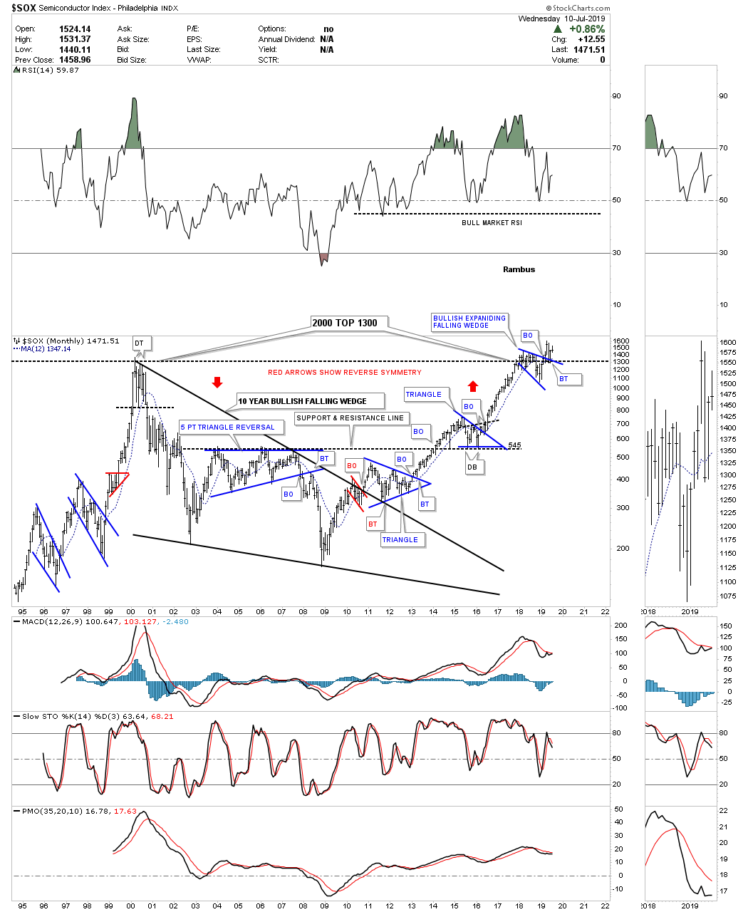
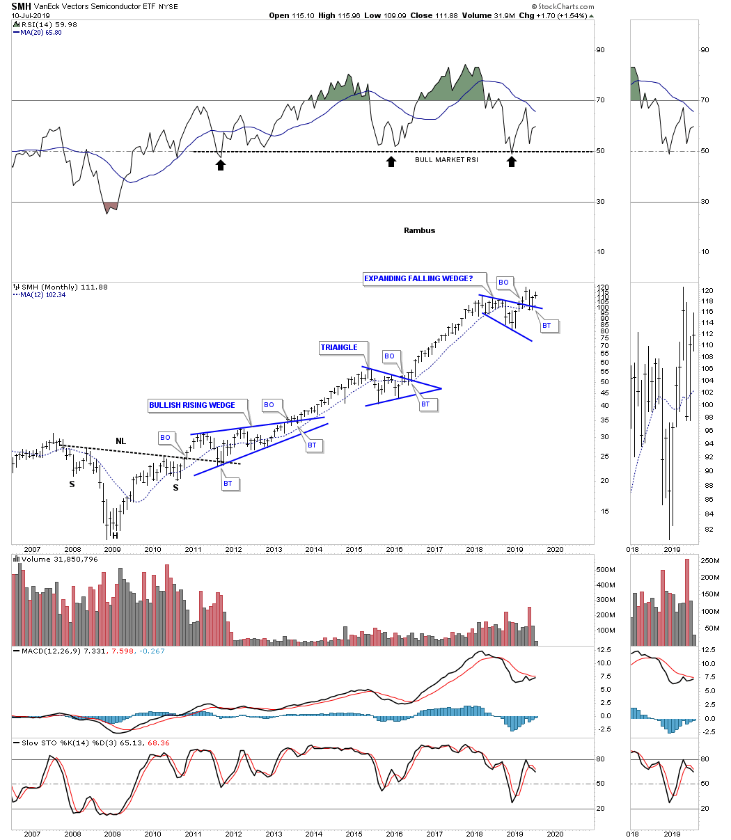
Another important sector that needs to be bullish during a strong bull market is the $SOX, semiconductor index. After putting in its bear market low in 2009 this index has been in a very strong bull market once the top rail of its 10 year bullish falling wedge gave way. As we saw with the $BKX, bank index, which hit its all time high for the second time in 2018, it’s very common to see a consolidation pattern form just below important resistance that should eventually give that sector the power it needs to finally breakkout into new all time high territory. The $SOX is doing the exact same thing and has formed an expanding falling wedge. As you can see there was a breakout above the top rail of the blue expanding falling wedge with a possible backtest now in progress with all this taking place in new all time high territory.
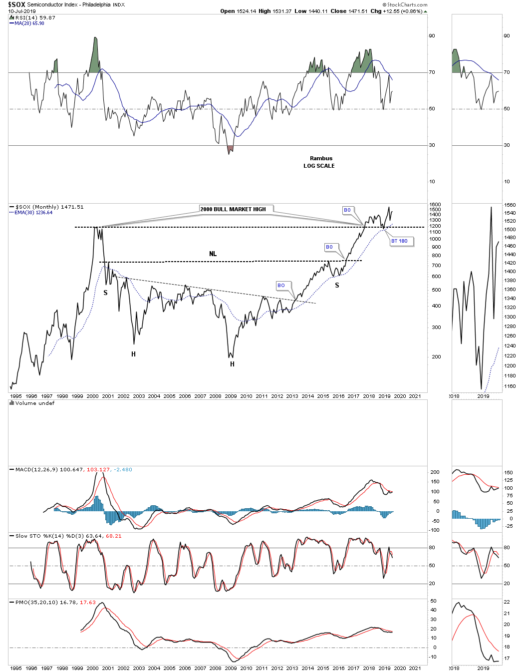
Below is a different version to the monthly bar chart above which I use a monthly line chart instead that can paint a different picture. First, note the breakout above the top rail of the 2000 high trendline with a nice clean backtest to the 1150 area. The other big pattern is the nearly 16 year H&S base. When I look at the bull market that started at the 2009 crash low it’s hard to imagine how so many investors have remained bearish the bull market.
Below is a different semiconductor index the SMH which shows you a beautiful bull market starting with the very symmetrical 2009 H&S bottom. After forming two previous blue consolidation patterns during its bull market run the price action has recently broken out of its 2018 bullish expanding falling wedge with a backtest in place.
The $DRG, pharmaceutical index, is currently trading at its all time highs after breaking out from its 2015 bull flag. Note that massive rally out of the 1994 low to its bull market high in 2000 that was something to behold. It took 12 years and the bullish falling wedge to consolidate those massive gains. There is one bit of Chartology in regards to that 12 year bullish falling wedge which we’ve seen time and time again with big multi year pattern. Note the H&S bottom at the fourth reversal point in the 12 year bullish falling wedge that was strongly suggesting that the price action was going to breakout and a new impulse move would ensue.

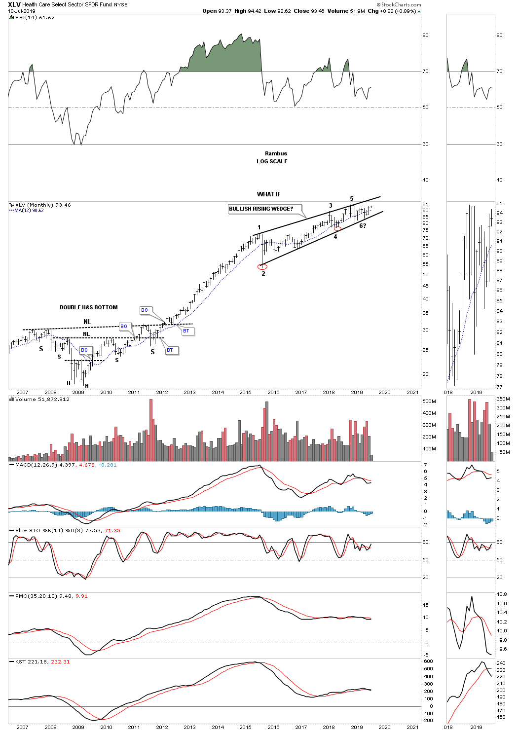
Another sector that had a fantastic run out of its 2009 low was the XLV, Health Care sector. This sector has been consolidating its massive gains starting in 2015 building out the bullish rising wedge which is often called a running correction.
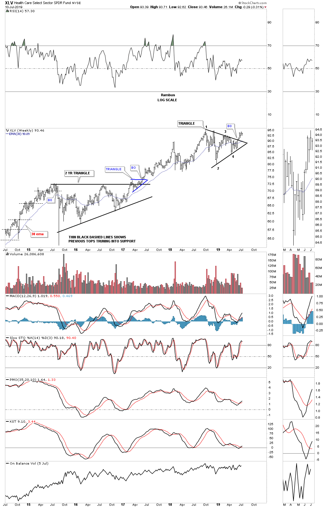
The shorter term weekly chart for the XLV shows a triangle consolidation pattern that was broken to the upside and is now 5 weeks into its impulse move.
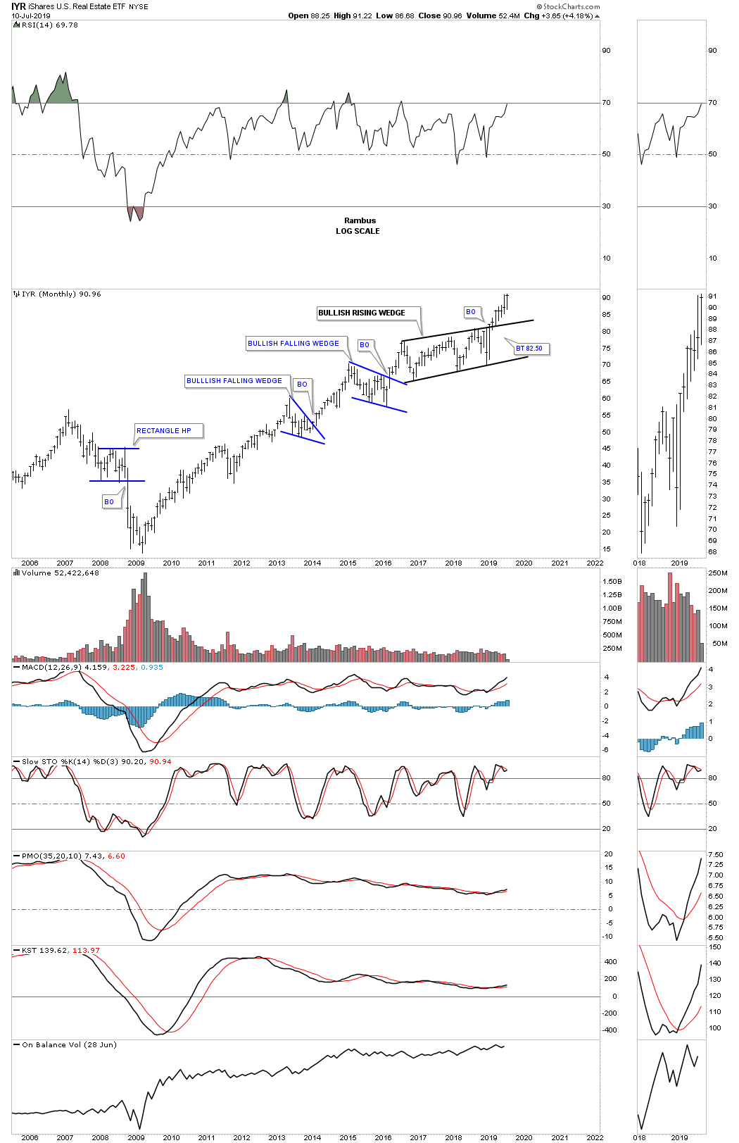
Another important sector to keep a close eye on during a strong bull market is the IYR, Real Estate etf. After building out a 2 1/2 year bullish rising wedge the IYR is now in its sixth month of its impulse leg to the upside.
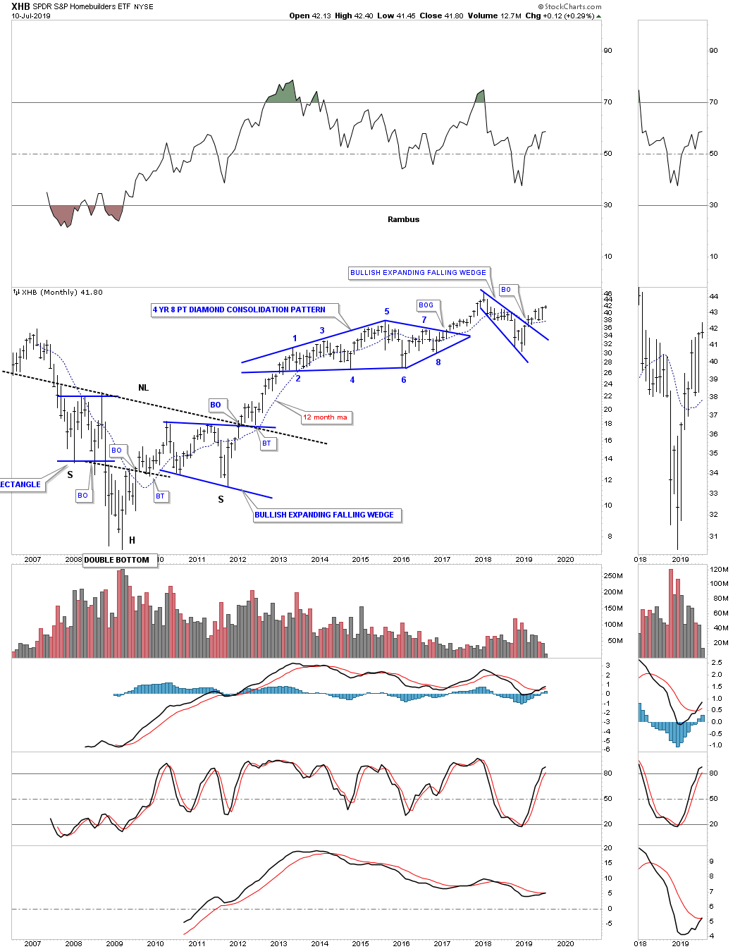
After building out a massive H&S bottom after the 2009 crash low the XHB, homebuilders etf, has embarked on a very strong bull market. After breaking out from the 8 point diamond consolidation pattern the XHB began its next impulse leg up to the high made in 2018. You may have noticed that one of the dominate chart pattens that is showing up is the 2018 bullish expanding falling wedge.
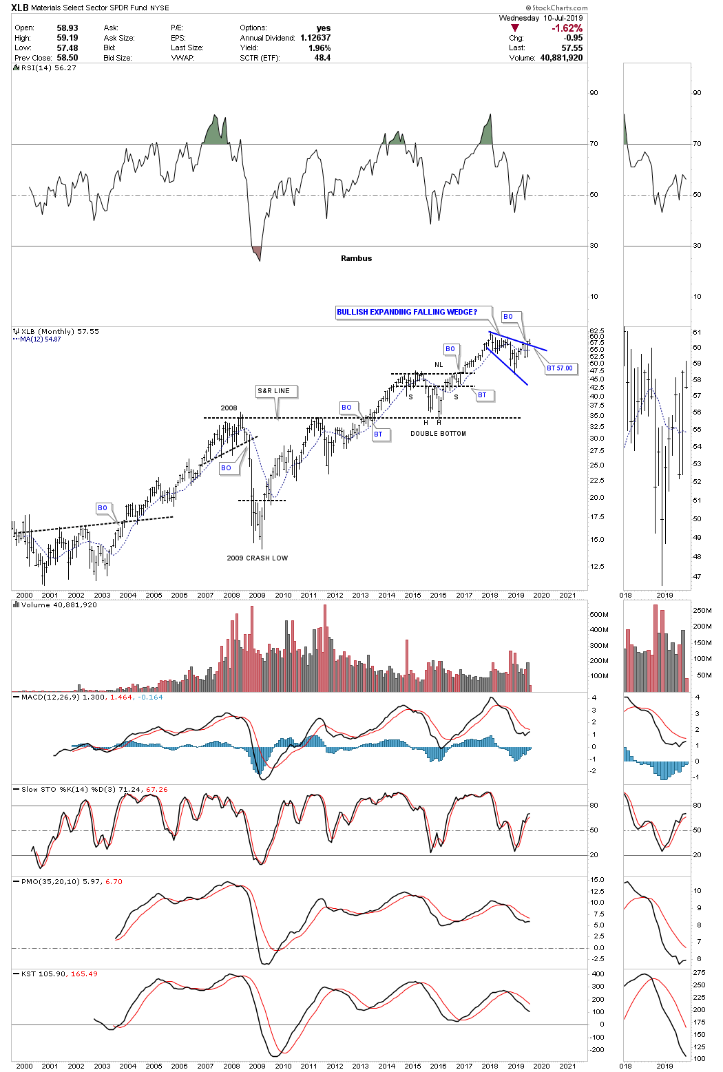
Another area that does very well in a strong bull market is the XLB, basic materials fund. There are many stocks in this fund that are also in the INDU so if the INDU is doing well then the basic materials sector will also be doing well. Again you can see the 2018 blue expanding falling wedge with a breakout and now the backtest to the top rail underway.
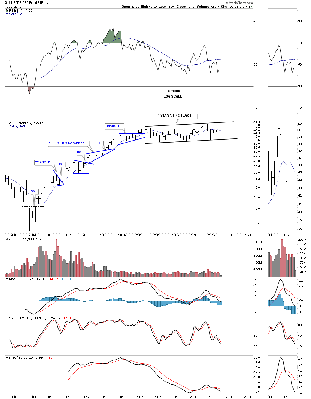
Another sector that enjoyed a strong bull market was the XRT, Retail etf, which formed one consolidation pattern on top of the previous one until it came time to consolidate those gains. Since the initial high in mid 2015 the XRT has been chopping out a now 4 year rising flag formation.
As most of the charts above show the 2009 bull market is still alive and well. As long as the consolidation patterns keep breaking out to the upside it does little good in trying to call the end of one of the strongest bull markets of all time. It will happen one day but there will be clues to help guide us in calling the top.
In part 3 of this quarterly report we’ll look at some of the more important stock markets of the world to see how they look in regards to their 2009 secular bull markets.
All the best…Rambus
Quarterly Report Part 3 : World Stock Markets
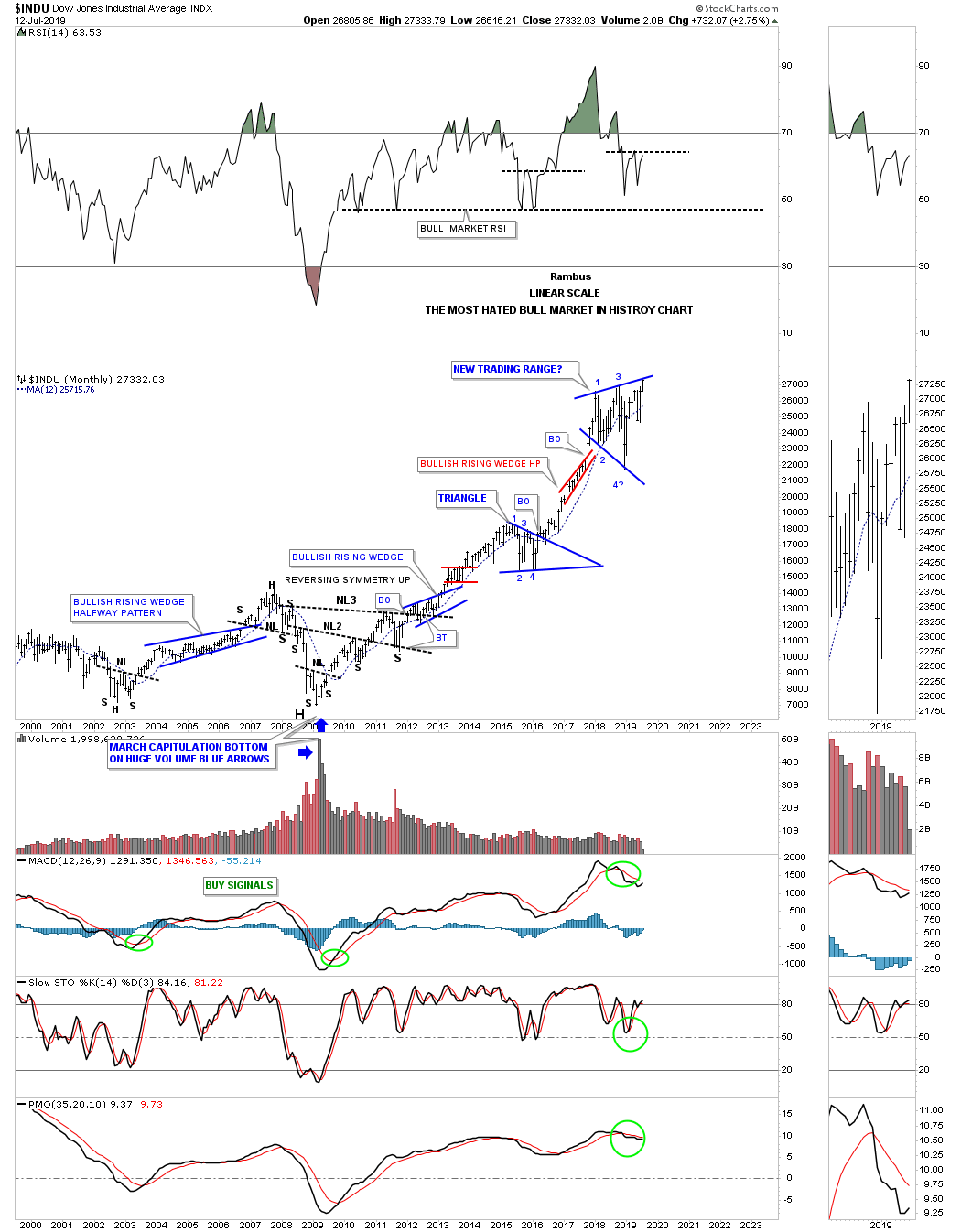
In part 3 of the Quarterly Report we’ll look at some of the larger world stock markets to see if their 2009 bull markets are showing signs of aging and getting ready to roll over into a bear market as many analysts are projecting. Before we do I would like to show you one chart with no annotations on it which just shows the price action and nothing more. This chart could be an hourly, daily, weekly or monthly look at this stock.
Most investors try to read everything they can on a particular stock looking for all the fundamentals reasons to help guide them on their purchase of shares. They may ask the questions, will interest rates have a bearing on the direction of their stock? How is the US dollar going to affect this stock? Are institutions buying or selling this stock? Is the stock showing strong or weak fundamentals using the PE ratio? I could go on as the list is very long regarding the fundamentals of buying a stock.
What makes trading the fundamentals so hard is the fact that investors can interrupt them in many different ways. Some will see the same fundamentals as bullish while others can interpret the same fundamentals as bearish. Also fundamentals can lag the price action as a stock can move well before the fundaments kick in.
From a Chartology perspective all the fundamentals are baked into the price chart which creates all the different chart patterns and overall look of the chart. It can take millions of investors, bulls and bears alike, that paint the charts of the dominate trend. In a bull market the bulls are in charge and the trend is up and just the opposite in a bear market where the bears are in charge and the dominate trend is down.
When looking at the chart below all it shows is just the price action. One doesn’t need to know all the fundamental reasons on why this stock has gone up only that it has. Obviously the underlying fundamentals needed to be bullish to have such an affect on the price action. I can tell you that many investors that looked at the fundamentals for this stock seen them as bearish and no way would they have ever bought shares. Again, it’s how one interprets the fundamentals for a stock that can determine if they will be successful or not. From a Chartology perspective and studying the price action alone one should have been bullish on this stock regardless of what the fundamentals might be suggesting.
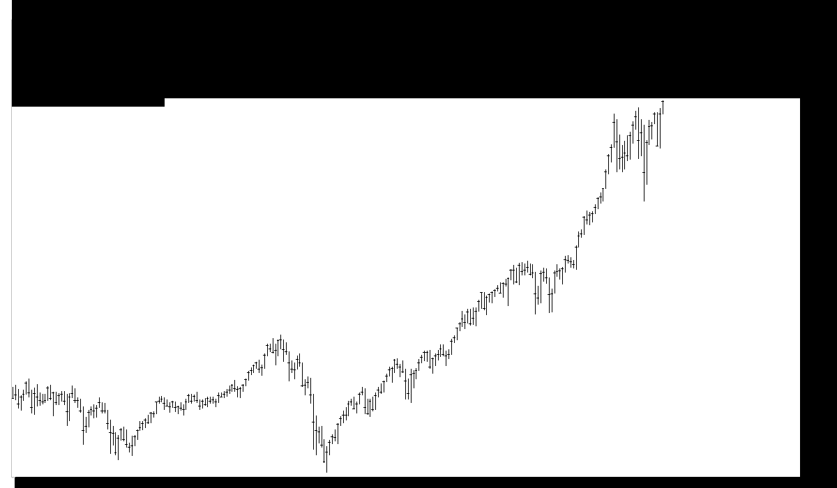
Some of you who have been following my work on the US stock markets may have figured out that the chart with no annotations above is a 20 year monthly chart for the INDU. I’ve been posting this chart for many years which I call, “The Most Hated Bull Market in History Chart.” I don’t want to beat a dead horse but for many investors they wouldn’t have even considered investing in the INDU based on the fundaments going all the way back to the 2009 crash low. Even after the biggest bull market in history many still refuse to believe the bullish fundaments that put the INDU at a new all time high last week. If you’ve been one of those investors that could only see the negative side of the US stock markets for the last ten years, you may want to rethink how you interpret the underlying fundamentals that just put the INDU at a new 10 year bull market high.
Now that we have that out of the way we can focus in on several of the larger stock markets of the world and what their Chartology is suggesting. Again, one can interpret the fundamentals anyway they see fit either through a bullish or bearish prism. Most of the stocks to follow will show a big multi year consolidation pattern similar to what the US stock markets showed in part one of the quarterly report. The charts to follow will be in no particular order and show the 12 month sma.
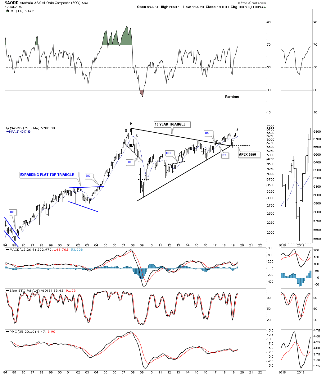
After breaking out from its 10 year triangle consolidation pattern the $AORD, Australian stock market, found support at the apex and is now approaching the all time high made in 2007.
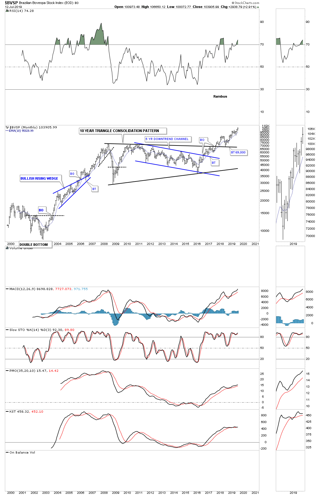
Next is the $BVSP, Brazilian stock market, which has been one of the stronger world stock markets since it broke out from its 10 year triangle consolidation pattern. After a nice clean backtest to the top rail it’s now trading at new all time highs.
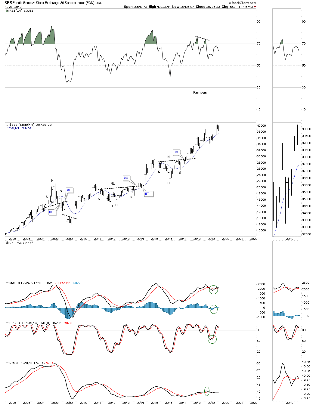
The $BSE, India Bombay stock market, I call the energizer bunny as it keeps going, going and going higher.
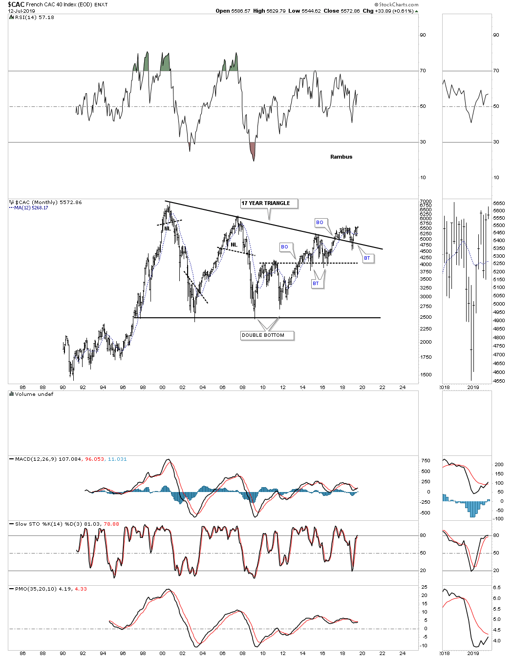
Next is the $CAC, French stock market, that broke out from its 17 year triangle consolidation pattern in March of 2017. There was a strong backtest to the top rail which is now the line in the sand, above is bullish and below is bearish.
After breaking out from its 12 year triangle consolidation pattern in 2013 along with most of the US stock markets the $DAX, German stock market, is building out a rising wedge formation just above the top rail of the 12 year triangle.

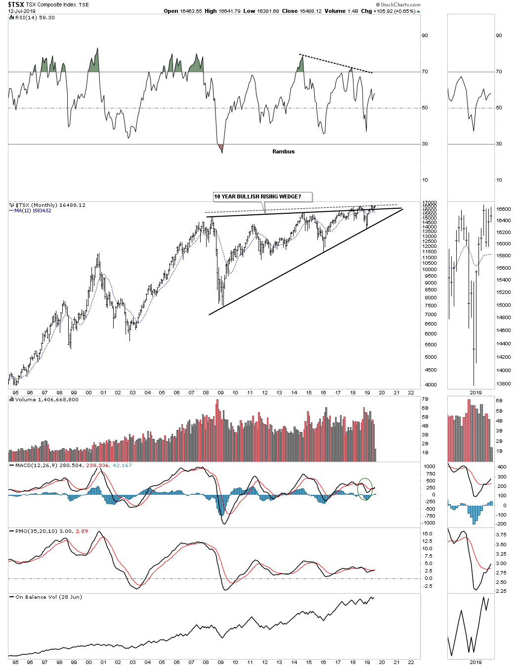
Below is the TSX, Canadian stock market, which is still working on a 10 year triangle and is attempting to breakout above the top rail.
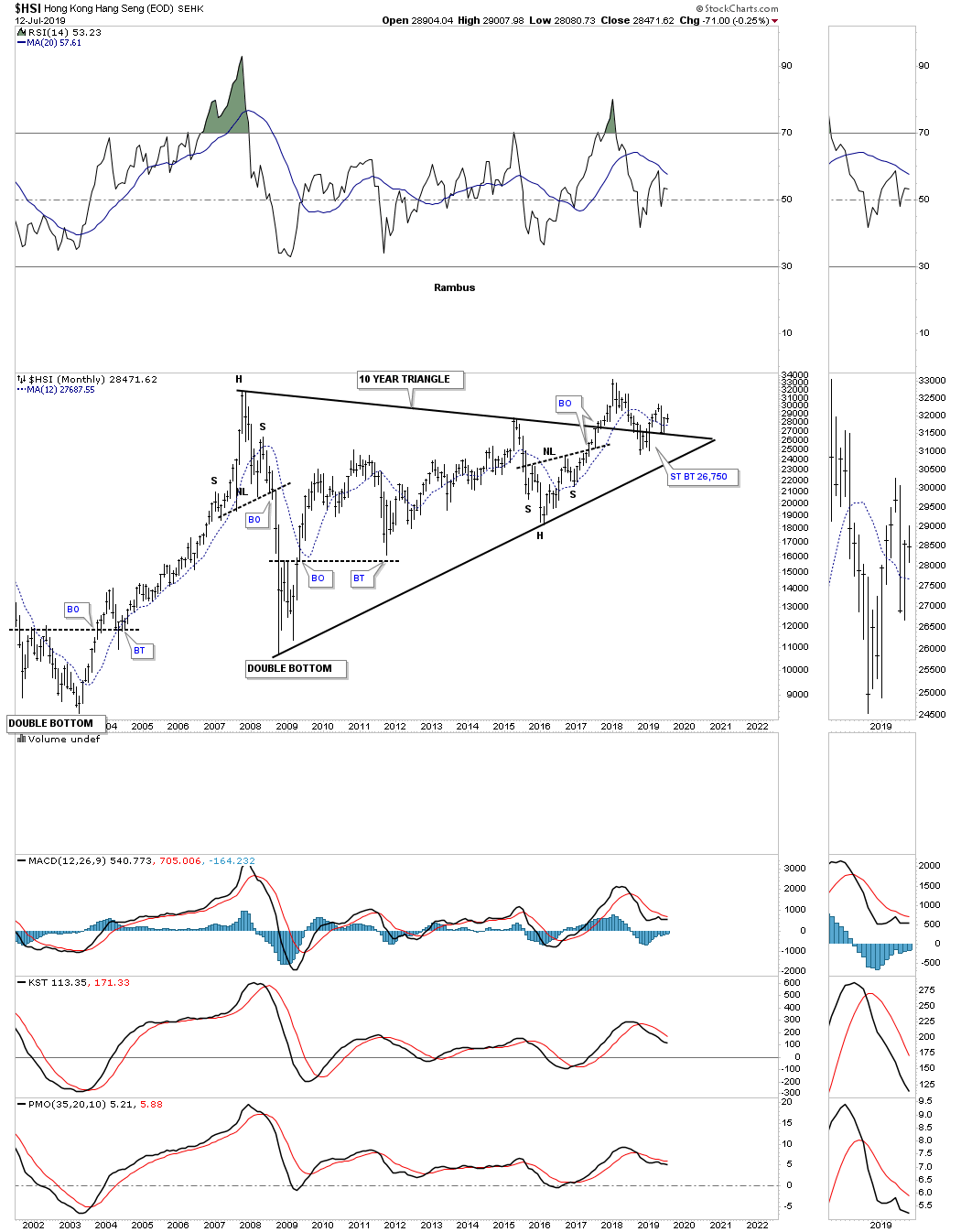
The $HSI, Hong Kong stock market, is attempting to breakout from its 10 year triangle consolidation pattern.
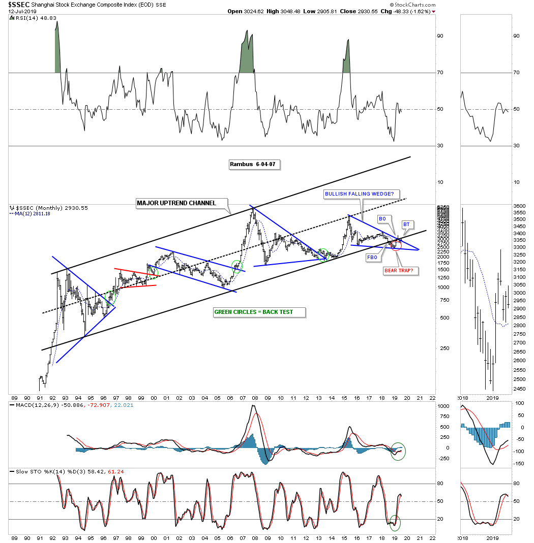
The SSEC, Shanghai stock market, is trading down to the bottom rail of its 1992 uptrend channel. There is a potential falling wedge which is forming on the bottom rail which could have bullish or bearish consequences depending on which direction the breakout occurs. I’ve labeled the breakout below the bottom rail of the uptrend channel as a potential bear trap. That could change if the price action breaks out below the bottom rail of the blue falling wedge.
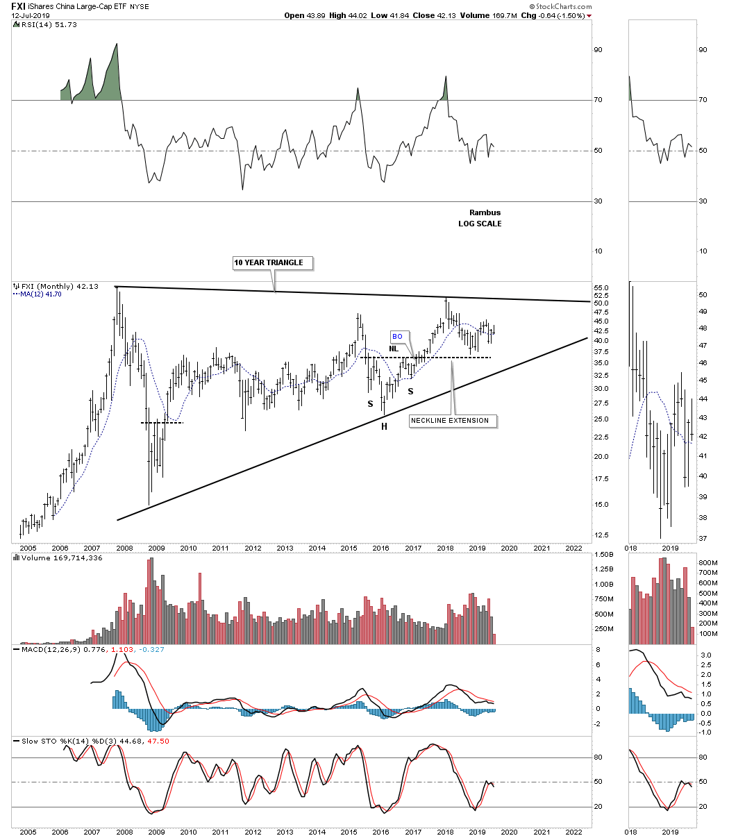
Next is the FXI, China large cap eft, which is building out a 12 year triangle trading range with no confirmed breakout in either direction as of yet.
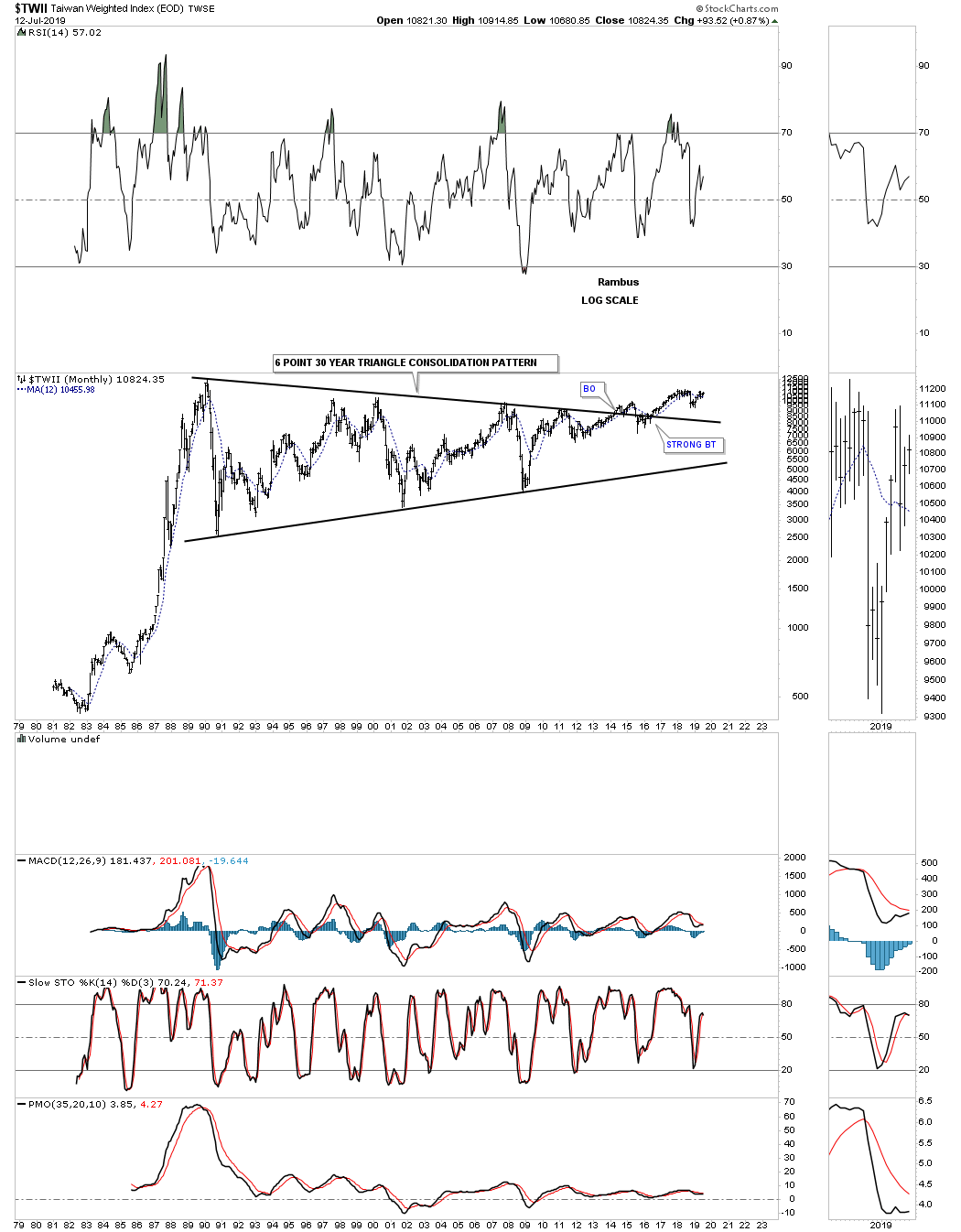
The $TWII, Taiwan stock market, has built out one of the largest consolidation patterns I’ve ever seen. After 30 years and six reversal points later the $TWII stock market finally broke out above the top rail in May of 2014. At this point I would like to see the all time high made back in February of 1990 taken out to add more confirmation the breakout is gaining traction.
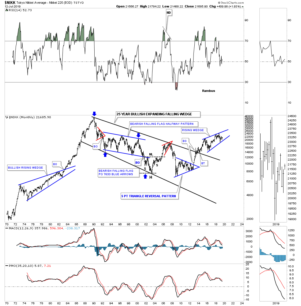
The $NIKK, Tokyo stock market, is setup much differently than many of the world stock markets we’ve reviewed. After its parabolic run Into its 1989 high it took 25 years to consolidate those massive gains forming a bullish expanding falling wedge. The price action is currently working on a four year rising wedge with the direction of the breakout undecided yet.
The AAXJ is an all Asian ex Japan etf, which shows it broke out from its six year bullish rising wedge with a backtest to the top rail about a year ago.

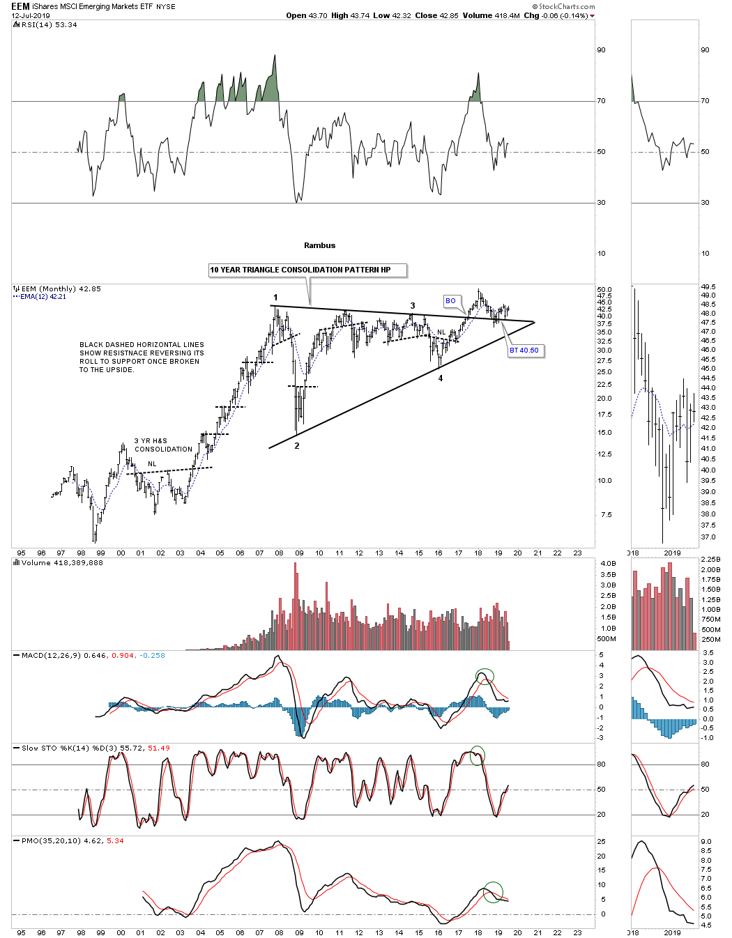
The EEM, emerging markets etf, built out a beautiful 10 year triangle consolidation pattern with a breakout and now the backtest is underway which needs to hold support.
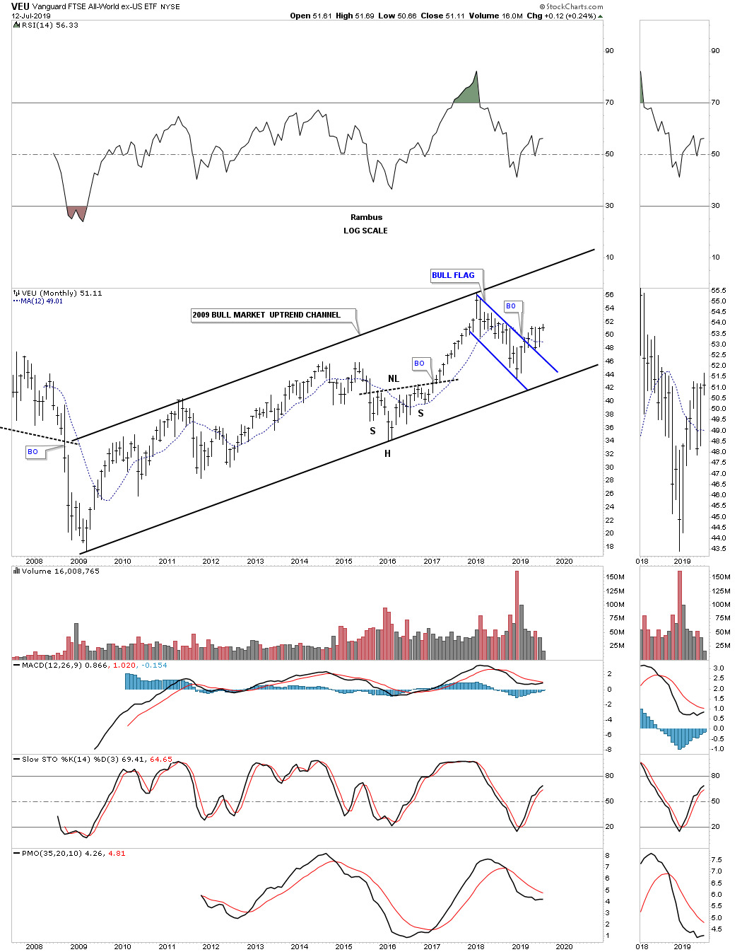
The VEU, All world ex the US etf, has built out a beautiful 2009 bull market uptrend channel with the recent price action breaking out from the blue flag.
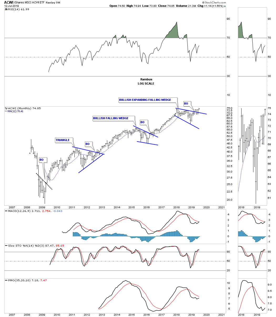
This last chart for tonight is the ACWI, all world stock markets, that resembles the bull market in some of the US stock markets with three consolidation patterns in place since its 2009 crash low. The price action is currently breaking out and backtesting the top rail of its 2018 bullish expanding falling wedge.
Maybe the fundamentals are suggesting the world is getting ready to crash and burn as so many analyst are suggesting. From a Chartology perspective maybe its a bit too early to expect the US and world stock markets to begin their new bear markets. After looking at all the charts above there is nothing in the charts that is suggesting the end of the world as we know it is upon us but just the opposite. One day the end will come but for now enjoy the bull markets from around the world while they last. All the best…Rambus
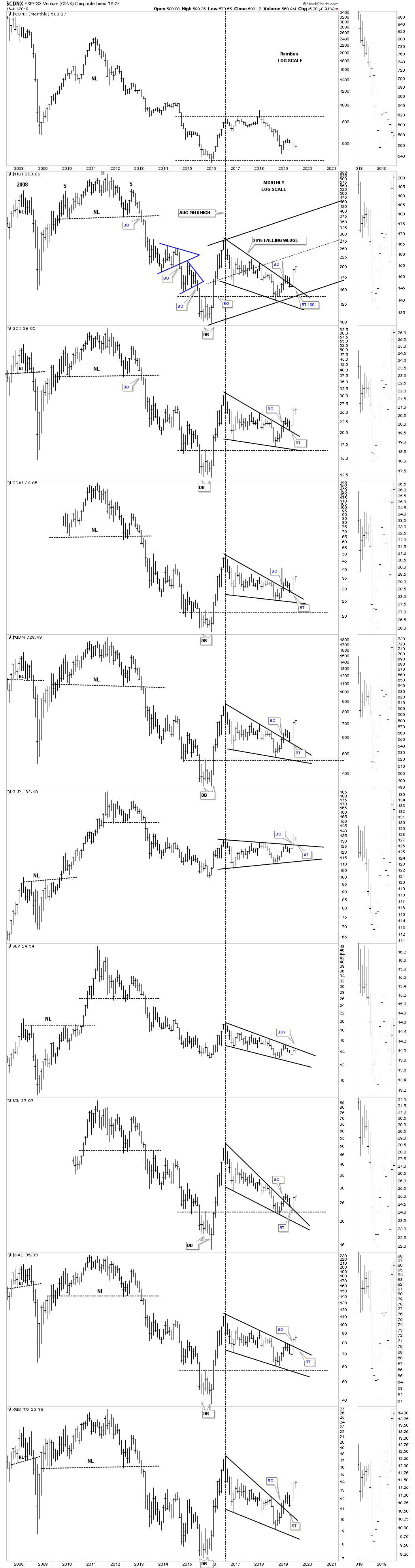
Quarterly Report Part 4 : Precious Metals Complex…
In part 4 of this Quarterly Report I would like to show you some charts for the PM complex in no special order that paint the emergence from the bear market to the new bull market. It’s confirmation that these charts show, that can help us stay strong when the pullbacks happen. No stock goes straight up forever and without the occasional pullback they can burn themselves out cutting short the life of the rally. Knowing where to look for these inevitable pullbacks can ease your anxiety when you become uncertain about what is actually taking place with the price action.
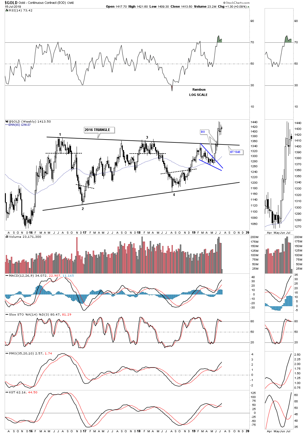
This first chart is a weekly candlestick chart for gold that shows its 2016 triangle consolidation pattern. During a strong impulse move up you will generally see a string of white candlesticks all in a row. You can see our current impulse move up from the bottom of the blue bullish falling wedge has formed a string of white candlesticks. The blue falling wedge which formed just below the top rail of the 2016 triangle was a good indication that this latest rally would take out the top rail which has occurred. Now after such a strong impulse move up we should expect to see either some backing and filling with the price action creating a small high level consolidation pattern or a backtest to the top rail of the 2016 triangle at 1345 or so. Note the high volume on the breakout.
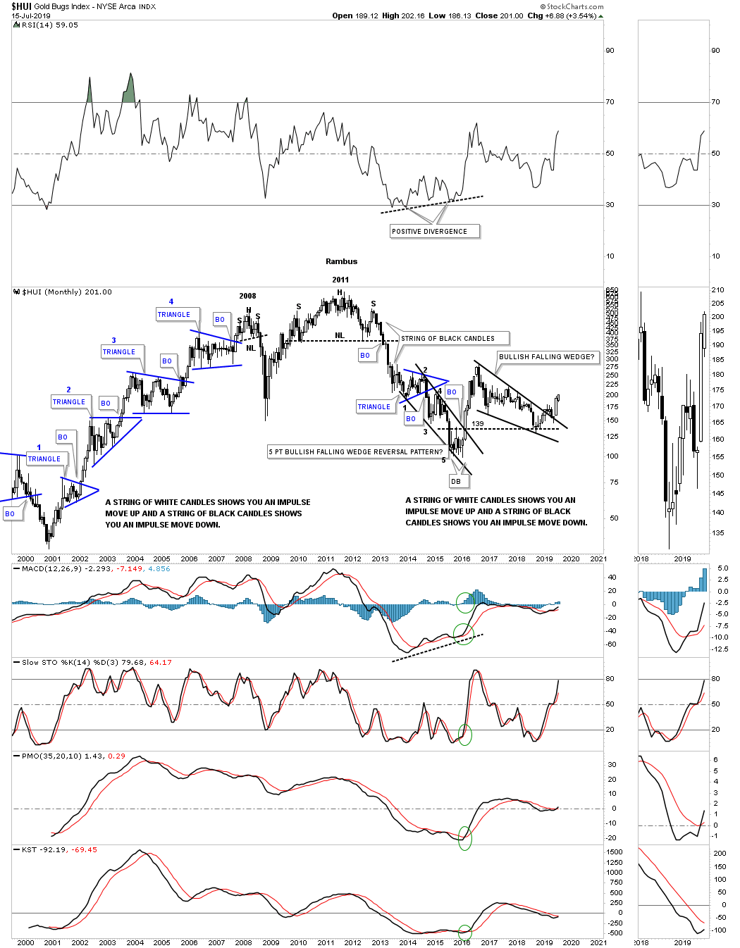
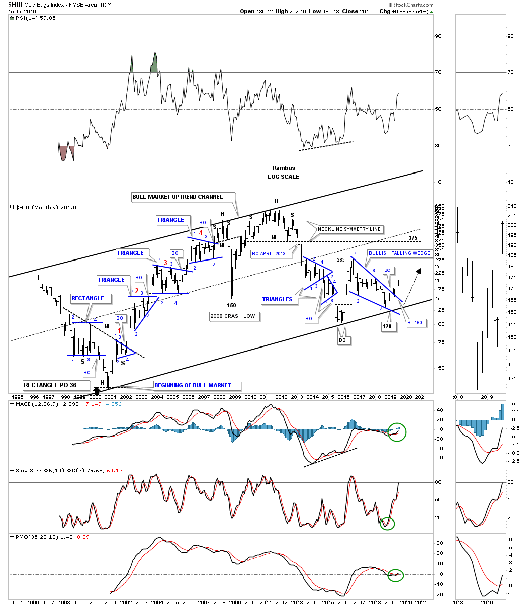
Next is a long term monthly chart for the HUI using candlesticks that show a string of white candlesticks all in a row which shows you a strong impulse move up with a string of black candlesticks showing you a strong impulse move down. Note the white candlesticks that showed each impulse move up during the bull market years which began at the last reversal point in each blue consolidation pattern. If you see a black candlestick form during a strong impulse move up it will generally mark a small consolidation pattern on the daily chart. After the backtest was completed to the top rail of its 2016 bullish falling wedge the HUI is now forming its second monthly white candlestick.
This next long term chart for the HUI is a monthly line chart that gives us a slightly different perspective for the bull market uptrend channel. It’s been about six months or so since we last looked at this chart with the dominate price action being the double top on the top rail of the major uptrend channel with the double bottom on the bottom rail. In an uptrend or downtrend channel it’s not uncommon to see a running double top on the top rail with a running double bottom on the bottom rail. What this chart also demonstrates is how close we are to the bottom of the major uptrend channel. Will we see the HUI trading all the way up to the top rail over the coming years?
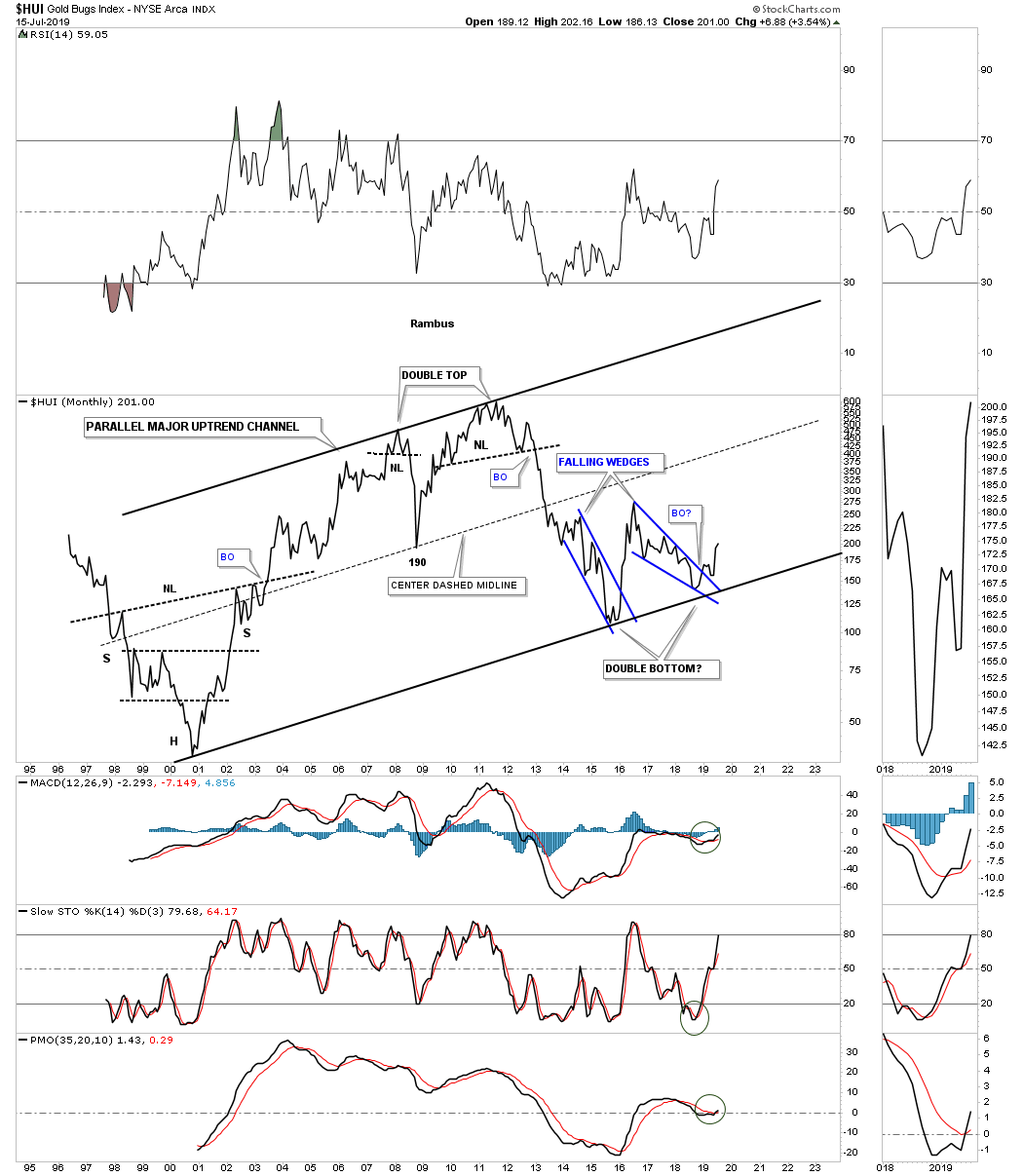
Below is the exact same chart as the monthly line chart above. This chart is a bar chart and shows all the Chartology from consolidation patterns, reversal patterns and impulse moves that begin at the last reversal point in each consolidation pattern, reversal point #4, or the right shoulder high.
It’s been awhile since we last looked at this combo chart which has the GDX on top with the $BPGDM, bullish percent index on the bottom. We’ve been following the positive divergence the $BPGDM has had with the GDX going back to the December 2016 low as shown by the red arrows. Just recently the GDX and the $BPGDM have both made a new higher high vs their February 2017 high as shown by the blue arrows which is a bullish development. Also the $BPGDM has been on its own individual buy signal since the May low when the $BPGDM traded above the 5 day sma and the 5 day sma traded above the 8 day sma for a bullish alignment.

How long have we’ve been waiting on this weekly line chart for gold to show us a spike above the golden neckline? Longer than I care to say. There is no more denying the fact that the breakout has finally taken place. Mentally we need to prepare ourselves for a backtest to the 2013 neckline around the 1340 area whether we get one or not. Less painful would be a small high level consolidation pattern. Note the confirming volume on the breakout above the Golden Neckline.
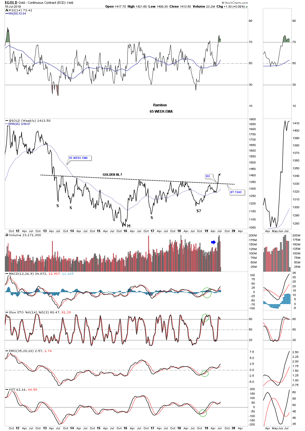
Below is a 15 year monthly bar chart which puts the 2013 H&S consolidation pattern into perspective. The minimum price objective for the 2013 H&S bottom would be up to the 1791 area. Note the smaller 2008 H&S consolidation pattern that took four months to complete the breakout and backtesting process.

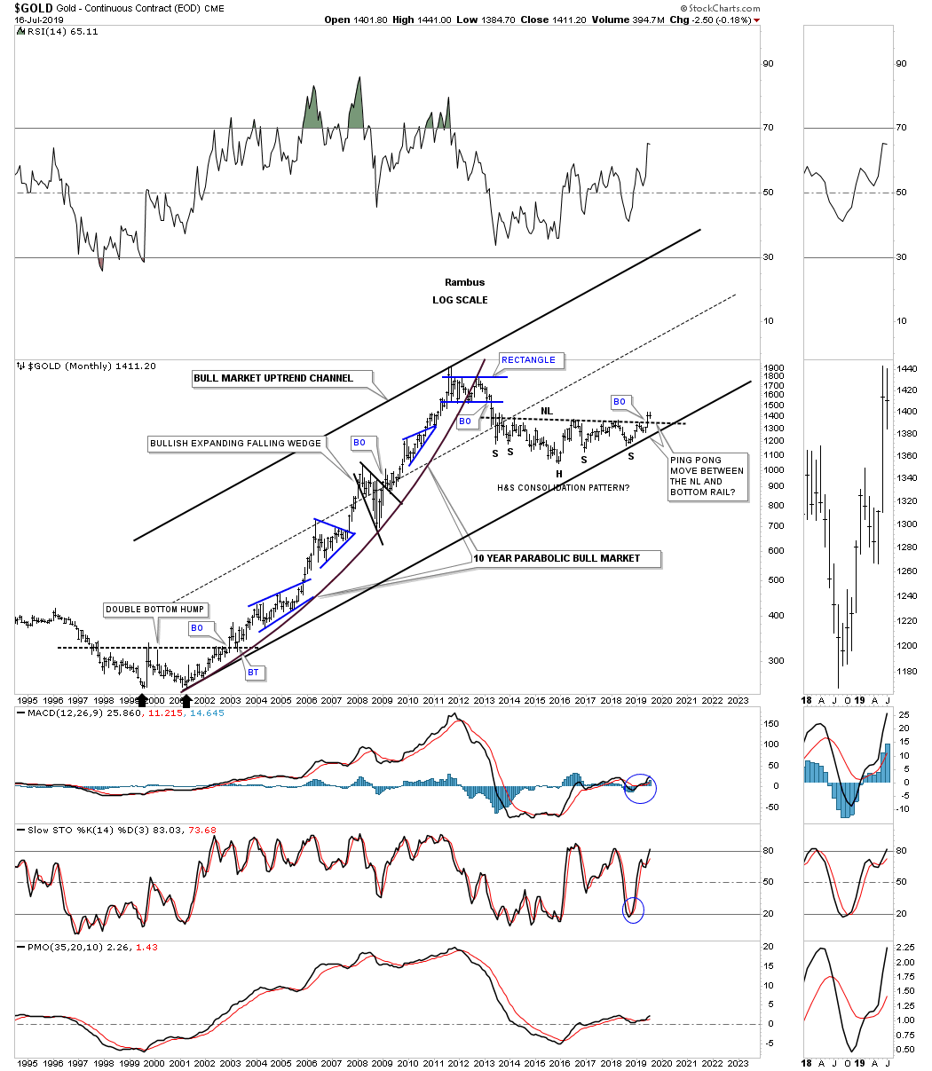
This last chart for gold really puts the 2000 bull market in perspective. One of the reasons its taken close to eight years of corrective action is because of the parabolic move from 2000 to 2011. That was a classic bull market in every sense of the word. Are we now getting ready to embark on the second major leg up in gold’s secular bull market? If big patterns have anything to do with it then yes.
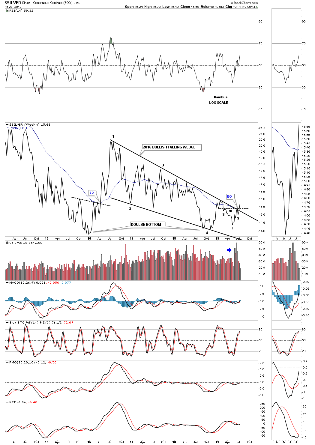
Today Silver finally joined the party with the rest of the PM complex as it broke out from a small H&S bottom just below the top rail of its 2016 bullish falling wedge which also took out the top rail.
This next chart is a weekly ratio chart which compares gold to the USD. About four weeks ago the ratio broke out above the top rail of the 2011 bear market downtrend channel which is a very important development. We shouldn’t be surprised to see a backtest to the top rail of the 2011 downtrend channel at 13.85 or so.

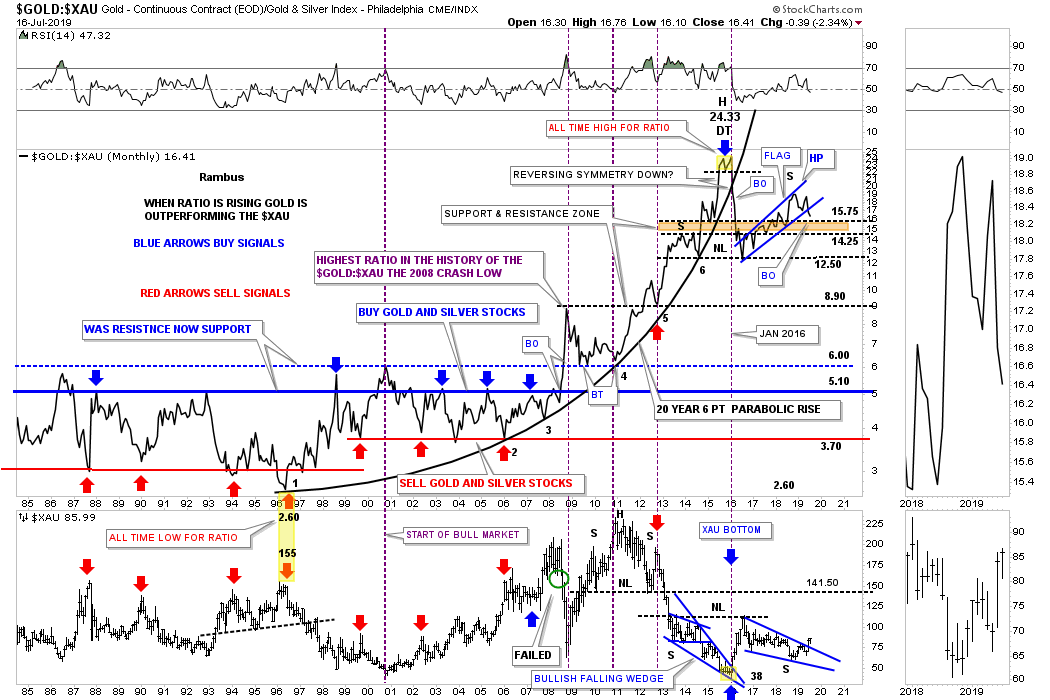
For a couple of years now we’ve been watching the Gold:XAU ratio chart on top with the XAU on the bottom, building out the blue rising flag on the ratio chart and the 2016 bullish falling wedge on the XAU. When the blue flag on the ratio chart finally gives way to the downside it will ensure that the XAU along with PM stocks in general will start to outperform gold in a big way possibly similar to the breakout below the black parabolic uptrend in January of 2016. Note the XAU chart on the bottom which shows the XAU is already anticipating the ratio breaking down by breaking out from its 2016 bullish falling wedge. Where will the PM stock be trading if the ratio chart on top trades back down into its old trading range between roughly 3.70 and 6.00?
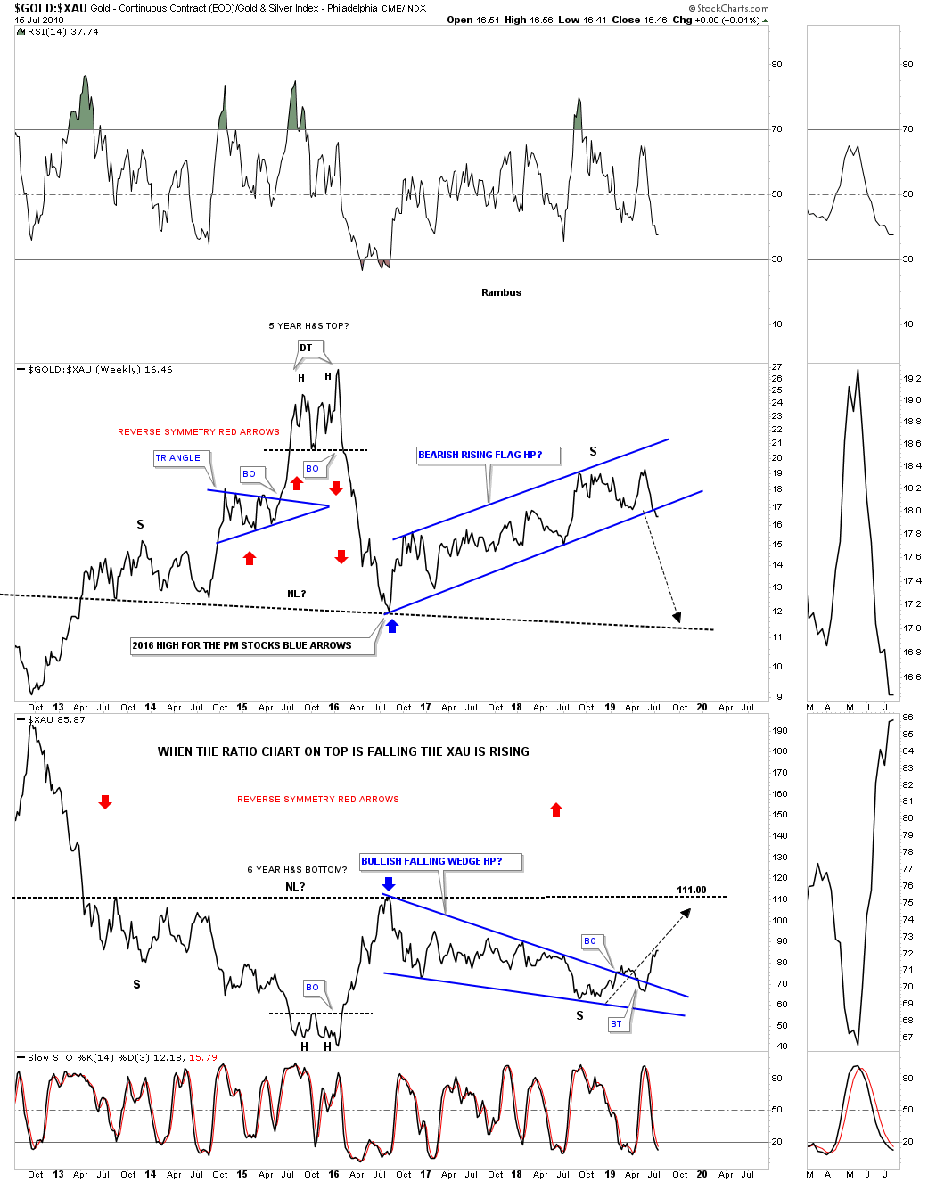
Here is a close up version of the ratio combo chart above that is finally showing a breakout below the bottom rail on the ratio chart on top and the $XAU on the bottom. All I can say its been a long time coming.
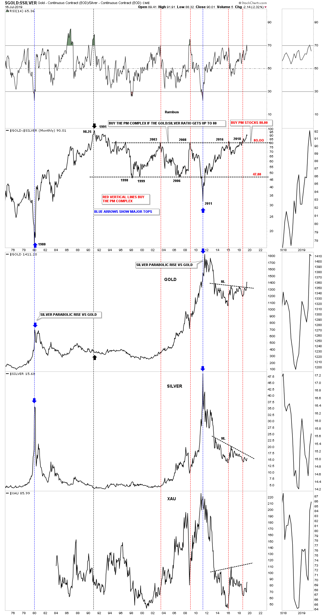
This last chart for tonight is the Gold to Silver ratio. When the ratio is rising gold is outperforming silver. It’s a general rule of thumb that when the ratio trades above 80 it is generally a good time to buy the PM stocks and silver as shown by the red vertical lines. This is just the second time in the last 50 years or so that the ratio has been this high which is suggesting the PM complex should be in bullish mode.
After almost eight years of corrective action in the PM complex it looks like this sector is ready to resume its 2000 bull market once more. By the size of the H&S consolidation pattern that gold has built out since 2013 that alone tells us to expect a multi year rally at a minimum. All the best…Rambus
PS: I forgot to add this monthly combo chart for the PM complex which shows the 2016 bullish falling wedges with the breakout and backtest to the top rail. Also note how big the 2011 H&S top was and how it led to the eight year bear market. Big patterns equal big moves.
Quarterly Report Part 5 : Currencies
In the 5th and final installment of the Quarterly Report I would like to show you some long term charts for some of the more important currencies of the world. Again, with large chart patterns things don’t change very fast which gives you time to watch and observe the evolution of each pattern until it either completes as expected or morphs into something else. For the most part the bigger the pattern the less likely that it will morph into something else. Most of these charts below we’ve been following for many years.
Lets start with the long term monthly chart for the $CAD, Canadian Dollar. The main feature on this 20 year chart is the massive combo, double top/double H&S top, which led to the Canadian dollars bear market. For the last four years the price action has been building out the blue rising wedge formation with a breakout and backtest in place.

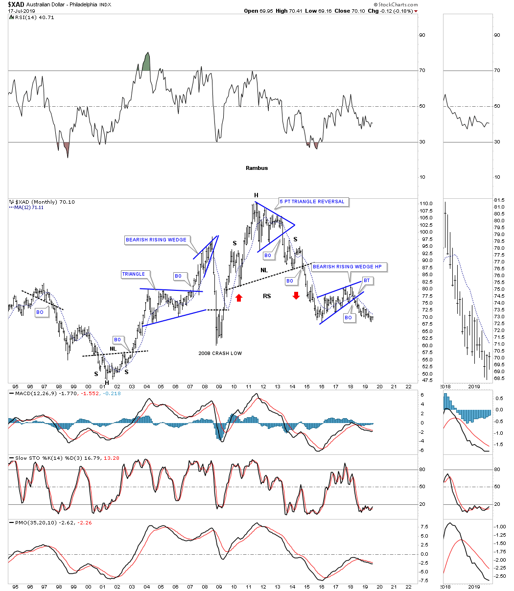
Next is the $XAD, Australian Dollar, that built out a large H&S top which led to its bear market. After the initial thrust down the price action carved out the blue bearish rising wedge that could very well be a halfway pattern to the downside.
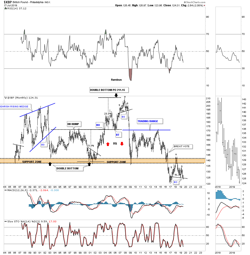
The $XBP, British Pound, is setup much differently than the rest of the currencies we’ll look at. After putting in a small H&S stop in 2017 which reversed the uptrend, the price action took a vertical move down to the 30 year brown shaded support and resistance zone. After chopping above the brown shaded S&R zone for roughly seven years came the BREXIT vote which sent the $XBP to a new all time low below the S&R line. Since bottoming in 2017 the price action rallied back up to the brown shaded S&R zone which reversed its role to what had been support for 30 years to now resistance. Note the possible H&S top that is building out directly below the S&R zone which is strongly suggesting the British Pound is likely to see a new all time low.
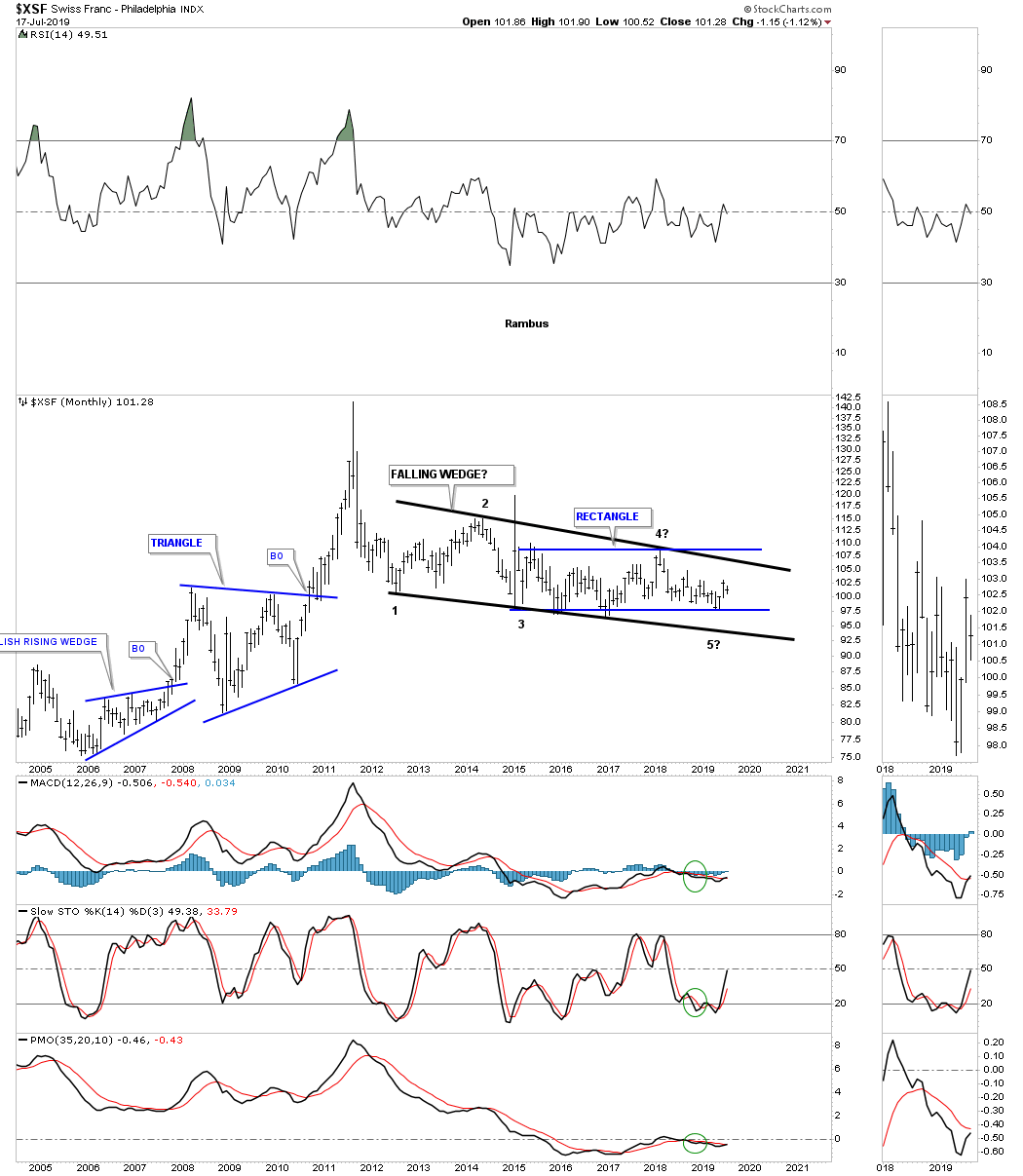
Next is the $XSF, Swiss franc, which has gone nowhere fast since the 2012 low which is the first reversal point in the black falling wedge. Inside of the 2012 falling wedge is another pattern that has been forming since the 2015 low at reversal point #3 which is the horizontal blue rectangle.
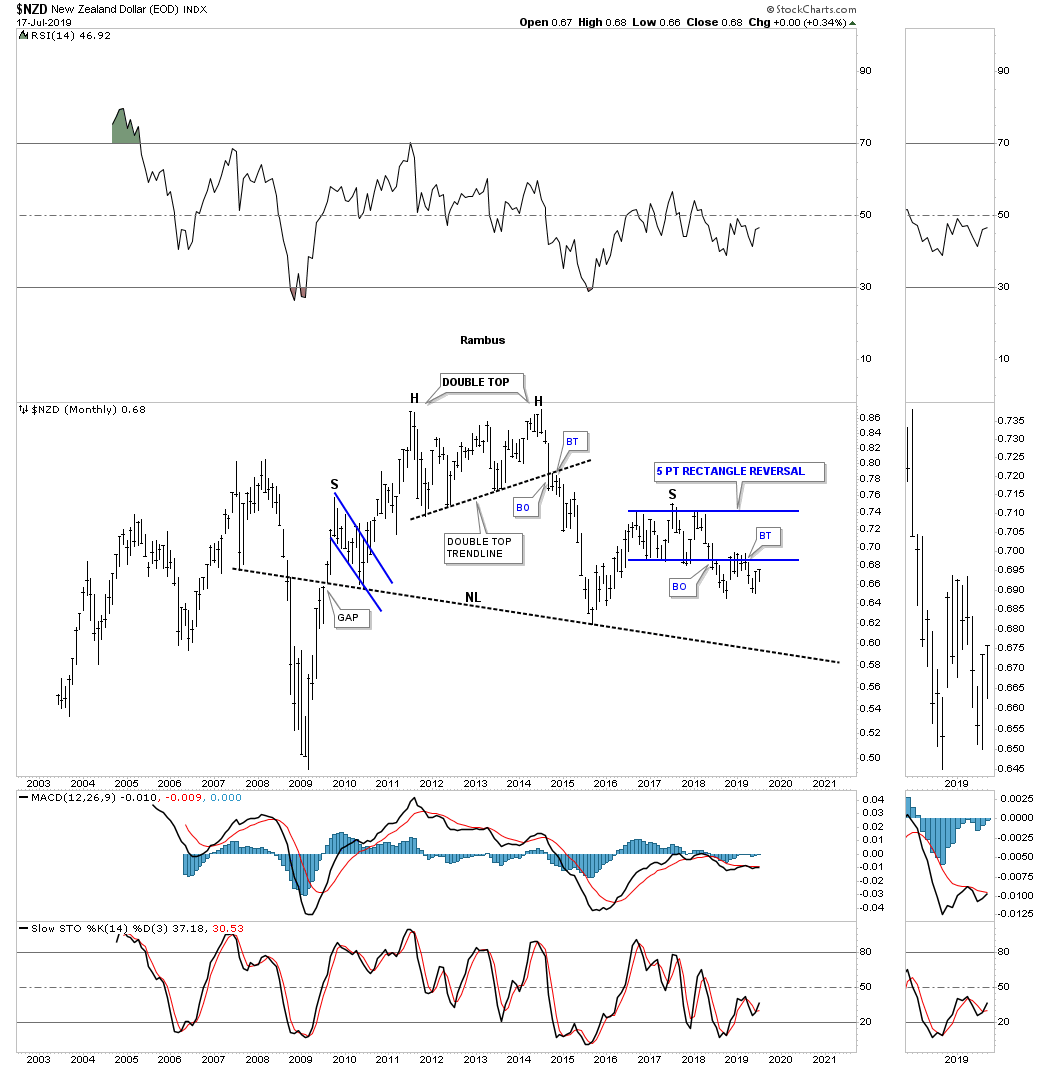
Like most of the currencies we’ve looked at tonight the $NZD, New Zealand Dollar, put in a massive double top to end its bull market in 2011 – 2013. After the initial impulse leg down the $NZD had a countertrend rally which stalled out and began to chop sideways building out the blue 5 point rectangle reversal pattern.
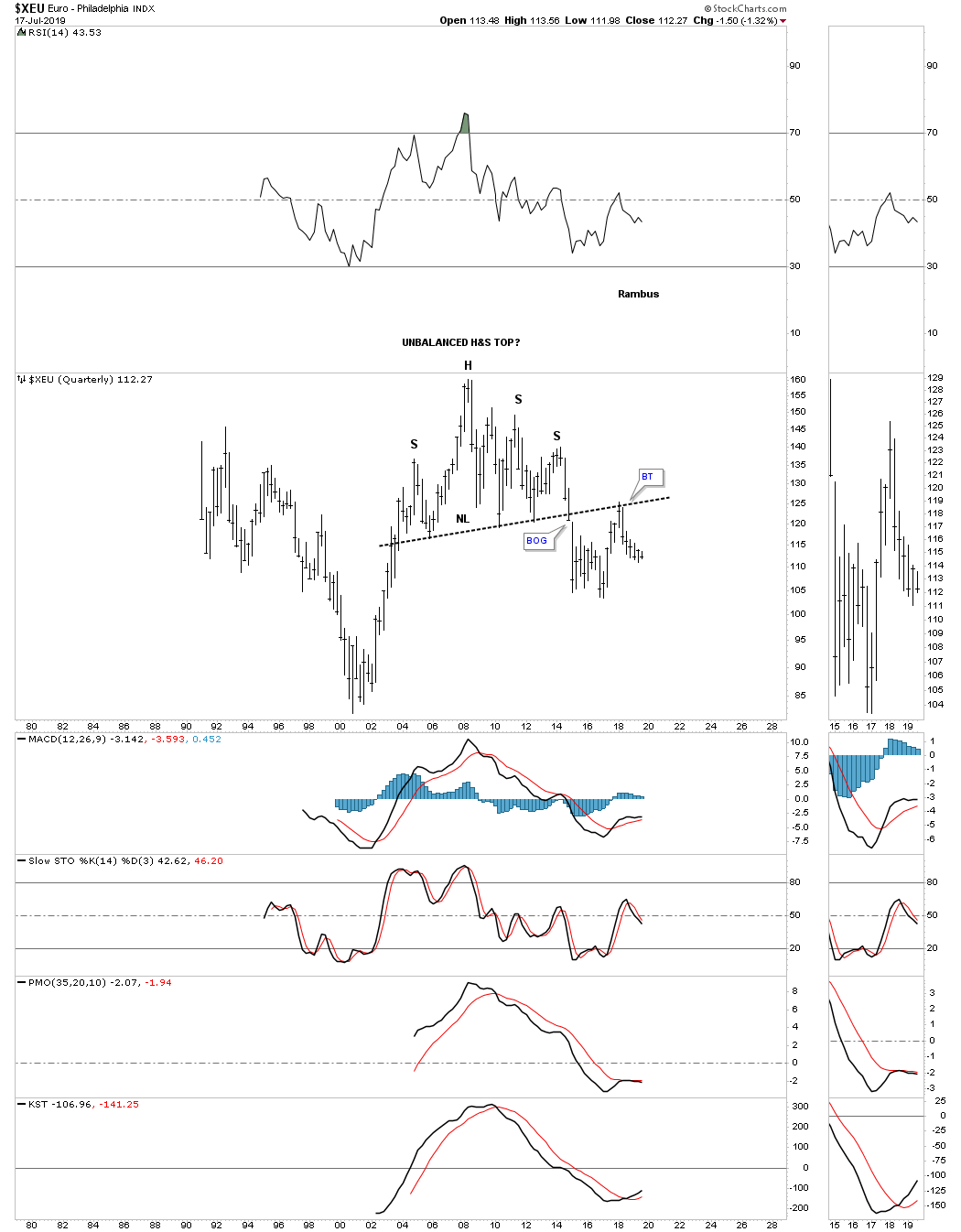
Now lets look at one of the more important currencies that make up the US dollar the XEU, euro, which built out a massive H&S top to end its bull market. After breaking below the 12 year neckline in January of 2015 the price action found support three months later and began a countertrend rally which took the XEU back up to the neckline as the backtest and rolled over. It’s possible that the backtest to the neckline is building out a very unbalanced H&S top. Keep in mind the unbalanced H&S top won’t be complete until the neckline is broken to the downside, so we wait.
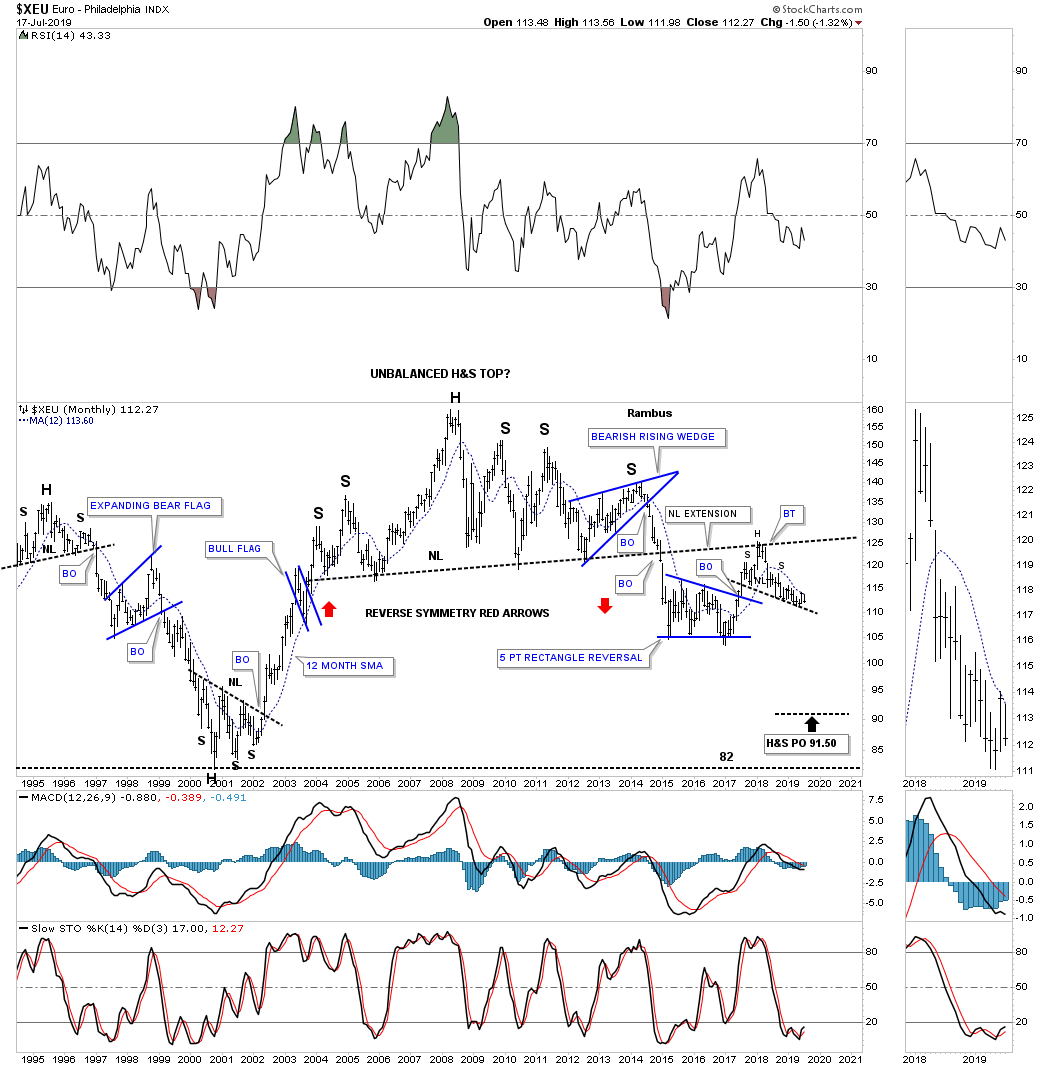
Below is the very long term quarterly chart which puts the H&S top in perspective.
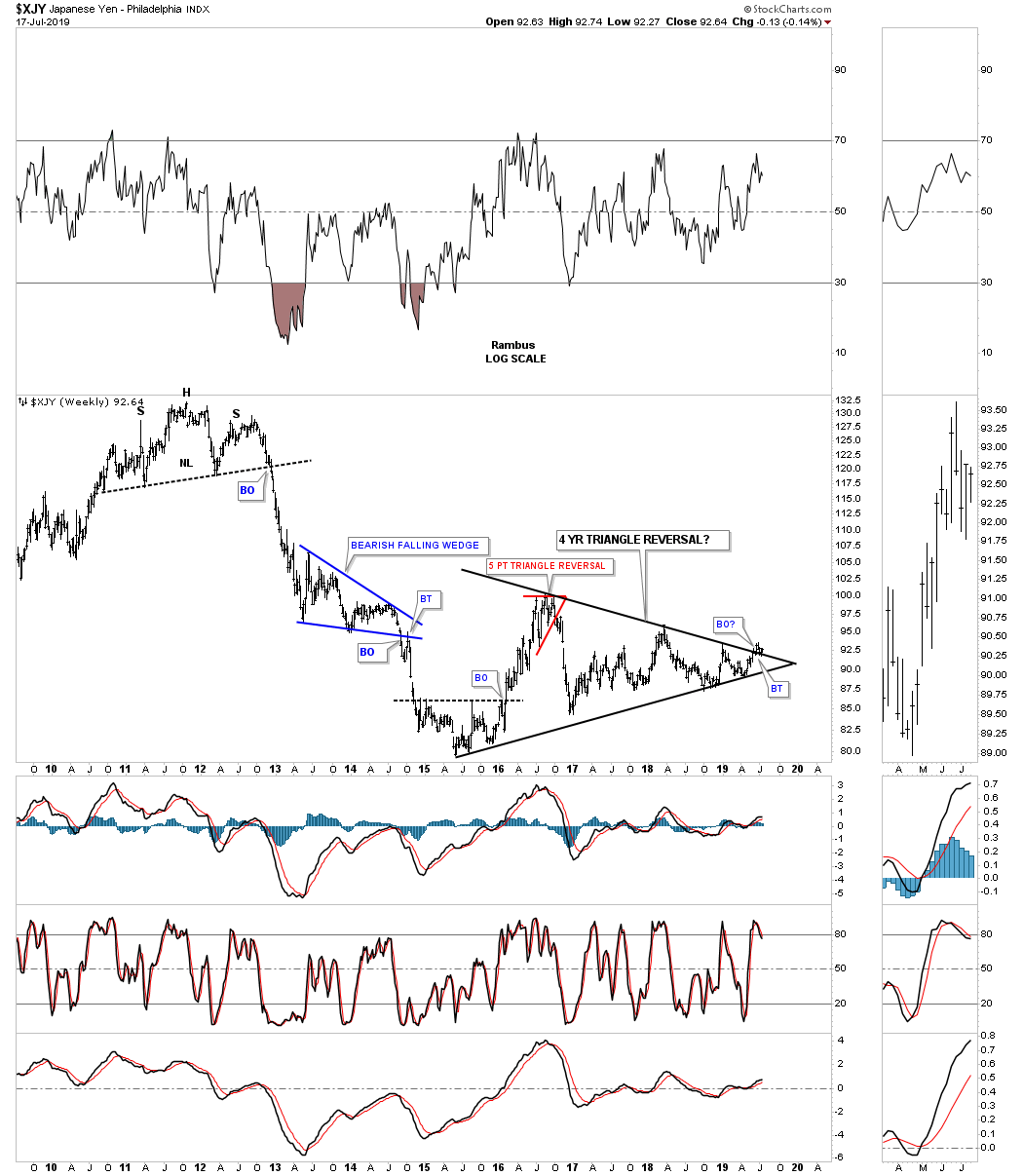
For those that are invested in the precious metals complex the $XJY, Japanese Yen, is the most important currency to keep a close eye on because for whatever reasons PM complex tends to follow this currency the closest.
Below is a daily combo chart which has the $XJY on top with GLD on the bottom. Even though they have completed different consolidation patterns they both broke out at the same time, as shown by the dashed vertical lines. As long as the neckline holds support these two should go up in tandem. Also note how symmetrical the Yen’s H&S bottom is, as shown by the neckline symmetry line.
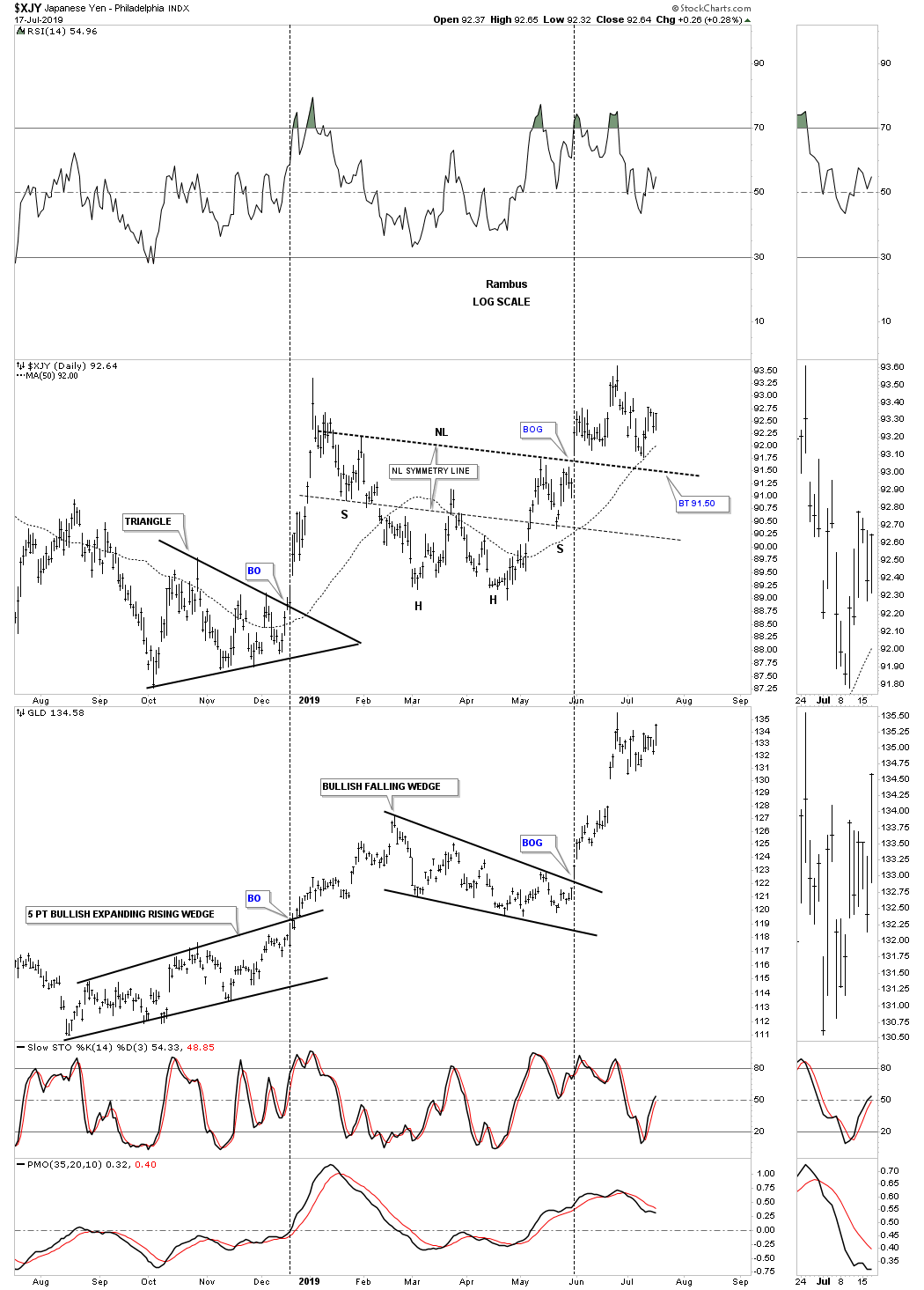
Below is a weekly chart for the $XJY which shows a possible 4 1/2 year triangle reversal pattern forming. There is a small breakout with a backtest in place. If the triangle reversal pattern is going to play out we need to see the price action start rallying strongly away from the top rail.
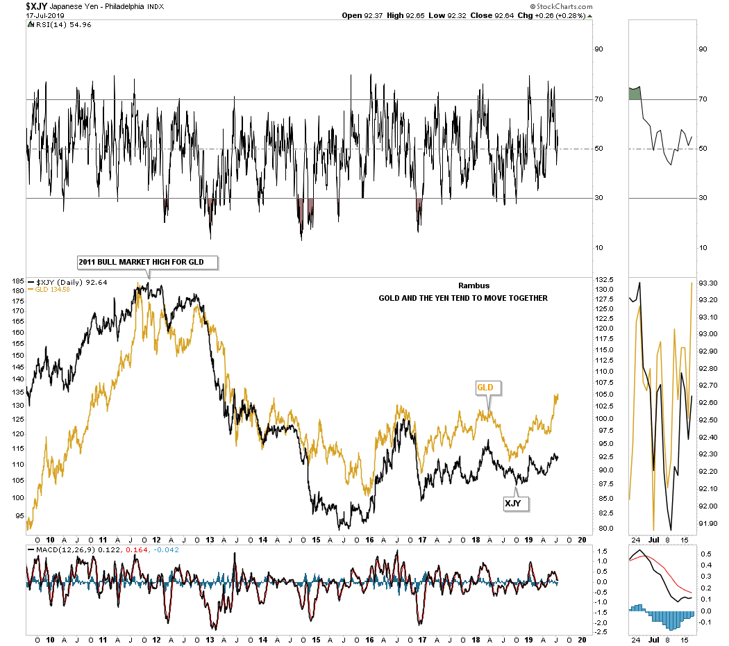
This next chart I overlaid GLD on top of the Yen so you can see the positive correlation for the most part. Keep in mind there is no such thing as a 100% correlation but they can be close. Since the first of the year you can see how GLD is rallying stronger than the Yen even though they are moving higher together.
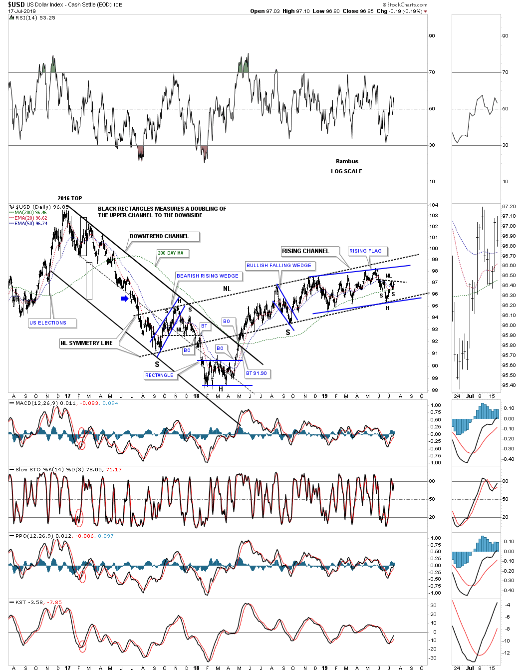
Lets now look at a few charts for the US dollar to see what they could be showing us. This first chart is a 3 year daily look which shows its 2016 downtrend channel which finally came to an end in 2018 when the price action formed the blue 5 point rectangle reversal pattern. From that 2018 low the US dollar has been on a slow and steady rise carving out the black rising channel. Last fall when the price action hit the bottom rail it looked like there was a good possibility that we could see a H&S bottom building out. As time went on the US dollar couldn’t breakout above the black dashed trendline only to decline back to the bottom rail. Now we can see two possible patterns forming inside the black rising channel which is the blue rising flag and a possible H&S bottom under construction.
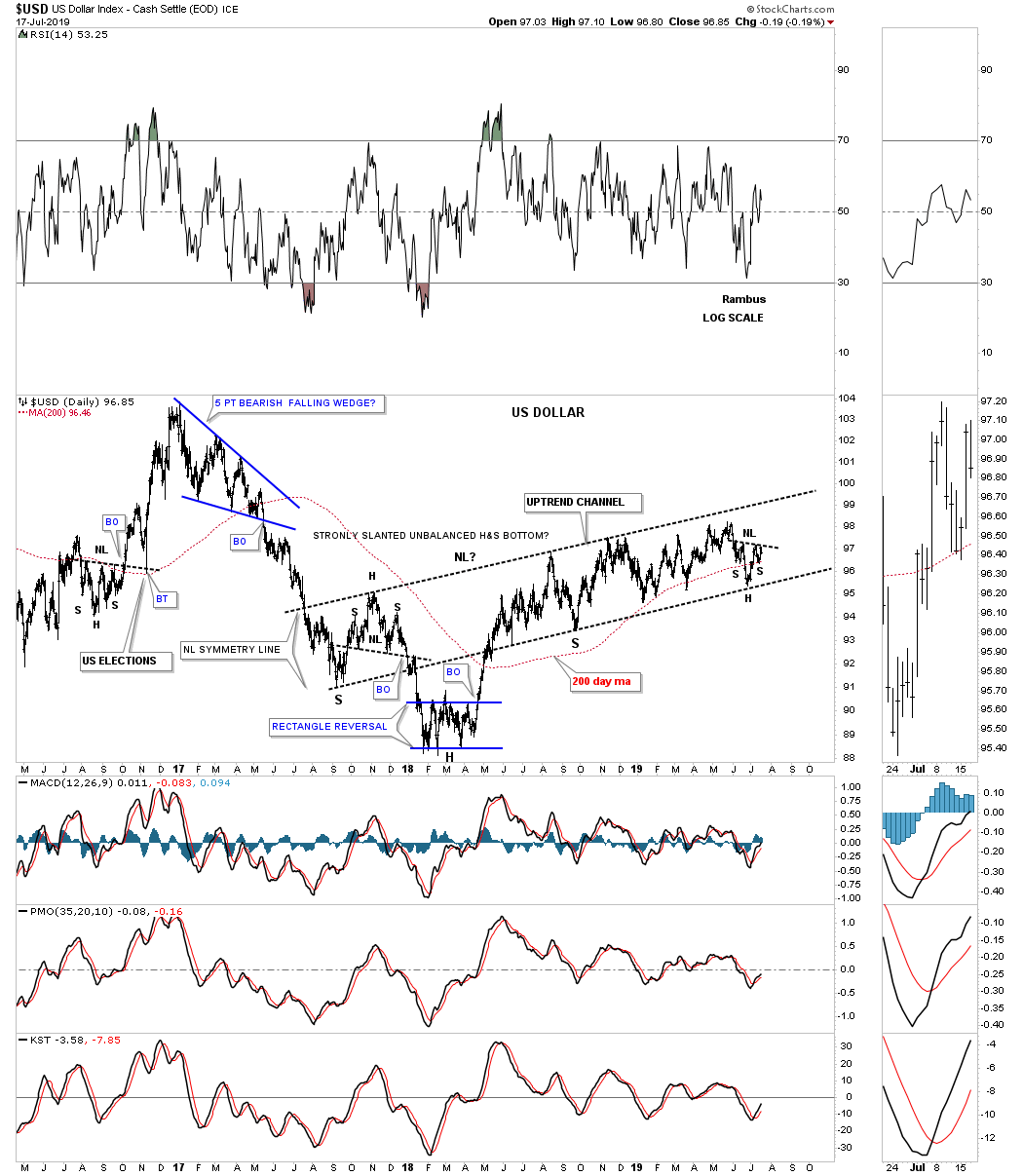
Below is a slightly cleaner look at the chart above going back to 2017.
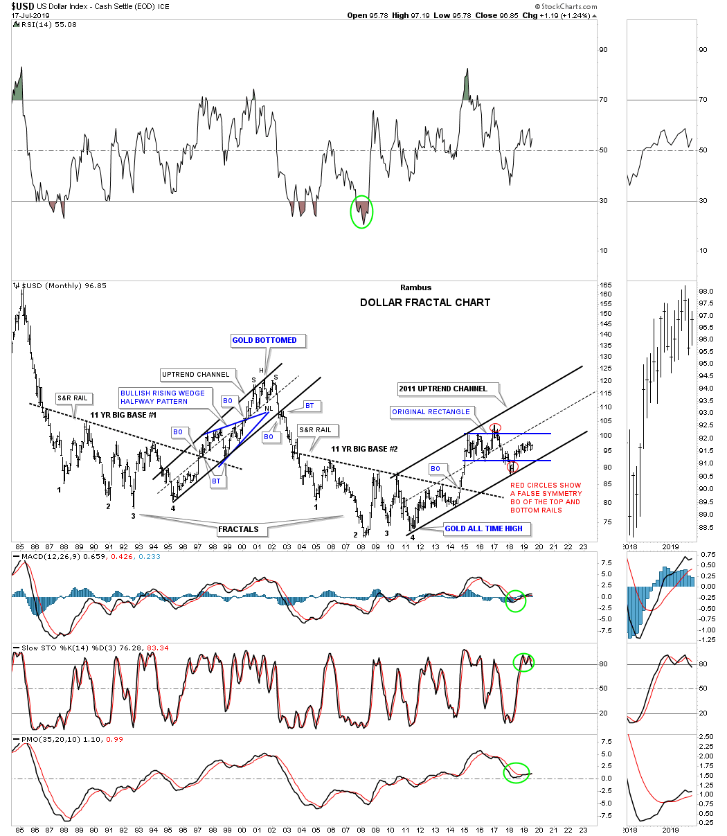
It’s probably been well over a year ago when I last posted this long term fractal chart for the US dollar which shows big base #1 and big base #2. You can see the strong impulse move up when the price action broke out from big base #2 which has led to the sideways chopping action. If you recall the US dollar traded sideways which looked like it was forming a rectangle consolidation pattern. After a false breakout above the top rail the price action traded back down to the bottom of the blue rectangle and then had a similar false breakout as shown by the red circles. The false breakout below the bottom rail of the blue rectangle found support on the bottom rail of the 2011 uptrend channel that is still in play.
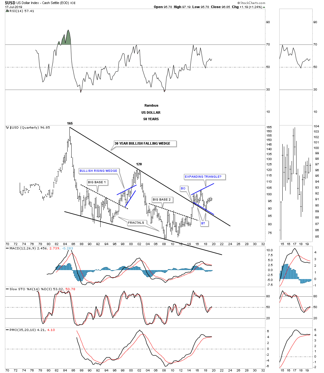
Below is another long term 50 year quarterly chart for the US dollar we haven’t looked at in a long time which shows a 30 year falling wedge with a breakout above the top rail and multiple backtests.
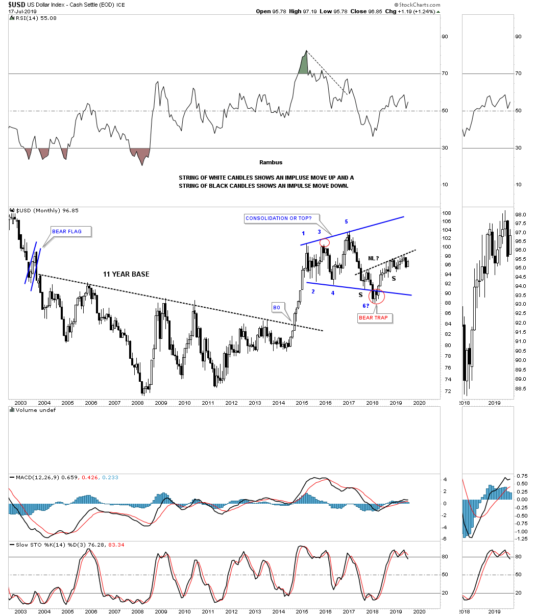
I’ve been trying to show you in the PM complex recently on how a strong impulse move looks using candlesticks. This monthly chart for the US dollar shows the impulse move out of the eleven year base. You can see a string of white candlesticks all in a row which shows you what to look for in a strong impulse move. Note the string of black candlesticks all in a row on some of the impulse moves down.
Keep in mind when you look at these long term charts to keep the timeline in perspective. Things can change very slowly when looking at monthly charts which can seem like an eternity before you begin to see confirmation that the pattern you’ve been following is truly breaking out. A good example is when I saw big base #2 forming a year or so before the actual breakout occurred. Once the breakout finally happened it was well worth the wait as shown by the impulse move on the chart below. All the best…Rambus
Related Reading:
- Rambus: Blockbuster Chartology – April, 2019
- Rambus: Blockbuster Chartology – January, 2019
- Rambus: Blockbuster Chartology – October, 2018
- Rambus: Blockbuster Chartology – July, 2018
- Rambus: Blockbuster Chartology – April, 2018
- 2017 Annual Wrap Up – Does Your Pension Fund Have A Deep State Drain? – January, 2018
- 1st Quarter Wrap Up 2018 Web Presentation
- Blockbuster Chartology with Rambus – October, 2017
- Blockbuster Chartology with Rambus – July, 2017
- Blockbuster Chartology with Rambus – May, 2017
- Blockbuster Chartology with Rambus – January, 2017
- Blockbuster Chartology with Rambus – October 20, 2016
- Blockbuster Chartology with Rambus – July 21, 2016
- Blockbuster Chartology with Rambus – April 21, 2016
- Rambus: Are We in a Deflationary Spiral? – January 28, 2016
- The Dollar, Gold & the S&P 500 with Rambus – October 15, 2015